Google analytics is by far the most useful tool that I use on the Internet when it comes to tracking the progress of my website. They provide you will all the information you could possibly need (and a load you probably won’t), completely for free. It’s a valuable resource and I’m here to tell you exactly what all the key features do and how you can use them to learn information which will make your website better.
- Map Overlay – See where your visitors are coming from.
- Browser – The browsers your visitors are using.
- Visitor Loyalty – How often your visitors are coming back.
- Length of Visit – How long each visitor stays for.
- Direct Vs. Referencing – How your visitors found you.
- Sources – Where your visitors came from.
- Search Engines – Your success with Google.
- Keywords – Your most popular search terms.
- Top Content – Your most popular posts.
- Navigation Summary – How your visitors browse your site.
- Entrance Sources – Referrers for individual pages.
- Landing Pages – Which pages your visitors are sent to first.
- Top Exit Pages – The pages your visitors leave from.
Visitors Overview
The number of visits is the amount of times that your absolute unique visitors have collectively visited the site, and the pageviews is the amount of pages that they’ve collectively visited in the times that they have come. Average pageviews is the amount of pageviews divided by the number of visits, giving you an indication of how many pages the average reader is viewing, which is good to keep track of as there are certain things you can do to improve this. Time on site is for the the combined total amount of time for the dates listed in your graph above, divided by the amount of visits. The best way to track the improvements of this is to look at it in smaller sections and not as part of the whole life of your site. Bounce rate is the amount of people who left your site after only visiting a single page, so you want this to be as low as possible. Finally, % of new visitsis the percentage of people who have come to your site, for the first time. My percentage is 67.64, which means that 32.36% of the visitors have been on my site before.
Map Overlay
The page tells you all about where your visitors are coming from, which may not sound that important, but I assure you it is – I use this information for all sorts of different things. I’ve found that two thirds of all my traffic comes from America which tells me that if I want to make money from Amazon Associates, I have to use American links as only about 10% of my traffic comes from Britain. It also tells what time of day that I should be posting content. I find that anytime after 5 o’clock is best as it means that the majority of America is going to be awake as 5pm over here is 9am in California. When I’m sharing content on Facebook, I want as many people to see it as possible so the time that I post it is very important. I posted a photo last night at about 1:30am and it got a really good response by the time I got up this morning because there were a lot more people viewing it.
On a much less obvious note, knowing that my main traffic comes from America, shapes the way in which I write. There are certain spellings that are different which I try to change so that it doesn’t stand out, such as; color instead of colour, or specialised instead of specialized, which might not sound like much, but I don’t want anything other then the quality of my content to stand out. There’s also slang over here that we might use that American’s won’t understand.
Browser
This isn’t particularly useful to me as I run a photography blog using wordpress, but if you’re a website designer, it’s important to view which browser your visitors are using and that’s just one more thing that Google Analytics can do. Browsers act slightly differently to each other so you want to check how your website acts in the most popular browsers. Currently about 40% of my viewers use Chrome, 25% use Firefox and 19% use Safari.
Visitor Loyalty
This is a particularly useful tool which I’ve only discovered recently which tells you the amount of times that everyone has visited your site. Over the last month, roughly 57% of my visitors have only visited my site once, but that’s to be expected as many readers may not be interested in what I have to say. When you compare that to July when I had a lot of visitors come to see top lists, that percentage goes up to around 67%. The people who only visit my site once don’t bother me, it’s the people that come again that I care about, as they’re my real audience.
In the last month, the second most visited amount of times was twice, which is to be expected, but what really surprised me was that the next two highest percentages are 15-25 times and 26-50 times and they represent about 4.5% each and count for 2100 visitors, which is huge for me. It shows me that I’m really starting to build a following so you can begin to see how useful this tool is. Back in July I was experiencing more visitors but these two brackets only represented 1.88% and 2.06%. If you’re looking for quality followers who are interested in what you have to say and potentially sell, then this is a great tool to get to grips with.
Length of Visit
Time on site can be a little bit misleading at times because you’re seeing an overall average time for the thousands of visitors that you’re receiving. That’s why I like to use the length of visit tool underneath the visitor loyalty section as it breaks down each visitor into different sections, for how long each of them spends on the site. I’ve just done a comparison of my site in the last month to the month of July and again, it shows that my quality of visitor has gone up with more people staying for longer and a lot less people staying for less than 10 seconds, which is useless to me unless they’re clicking on an ad and leaving. Here’s a comparison for the two months, which I’ve put into pie charts for easy comparison.
Traffic Sources
When you select traffic sources, you’re taken to their dashboard where you’ll be able to select the period of time which you want to study as well as glance over all the relevant data from this time. This includes comparing your traffic sources and search engine traffic, as well as being able to see the most popular keywords. The dashboard is particularly helpful for helping you find your way around the sections that you need, and it acts as a general overview of all the information that you’ll regularly need to see without delving too much deeper.
Direct Vs. Referencing
Direct traffic is pretty simple, it’s the amount of visitors who have come to your site through no other means, or at least that’s what it looks like. It’s actually doesn’t tell you a whole lot about your reader because there are ways for traffic to appear as if it’s come direct, when really it’s come through a program that manages a website such as Twitter. It’s believed that about half of the traffic that comes from twitter is viewed through a piece of software such as TweetDeck, which makes it appear as if it’s direct. I don’t really pay too much attention to direct traffic as I know that my readership is growing and more people are coming direct to my site, which is demonstrated through other statistics on my site such as Visitor Loyalty.
Sources
This is probably one of my most frequented statistics because my website relies heavily on referenced traffic, and that’s what the traffic source section is all about. People are surprised a lot of these features are even possible, let alone all in one place, but that’s what I love about Google Analytics; they make it so easy for us. When you can study where your traffic has come from, as well as how long they stay on the site, which page they’re viewing when they leave, how many pages they visit, and how often they’re visiting; you’re given a distinct advantage in knowing how to make content which will suit your readers.
From looking at the sources section, I know that I get a lot of readers from StumbleUpon, and on top of that, I know which pages they like to look at. If I want a lot of traffic, all I have to do is look at which pages they’re looking at and write more content like that. Looking at sources is also a great way of tracking how well my social marketing is going, and I can see from my second most popular being Facebook that it’s going very well this month. You can then click on the source to find out more detailed information about how many people came each day. In the past month, my clicks through Facebook range between 53 and 191 a day.
All of this useful information is listed in columns on this page showing the visits, pages per visit, time on site, % of new visits and bounce rate for each source.
Search Engines
To me, this is the traffic that I strive to reach the most as I’ve written 85 posts over the past 5 months and I’d like people to be able to find them. If I’m in Google more then I’m going to be reaching more people who are looking for exactly what I’m trying to teach them, and these people always work out to be better viewers. By this, I meant that they spend more time on the site, look at more pages, and invariably, click on more ads, which earns me money.
When you enter the Search Engine page, you’re given another timeline overview of all the hits that you’ve received from the different search engines. Again, they list all the details that you could possible want in an easy to read chart, and then when you click on a particular search engine, they tell you what were the most popular keyword results which took people to your website. I say a particular search engine, but we all know that there’s only one that really matters and that’s Google. Here’s a pie chart of my search engine referrers – it’s easy to see who’s on top.
Keywords
If you want to know more about how to rank well in Google (and you do), then it helps to know which are the most popular keyword search terms. When you see what’s popular with Google in comparison to sites like StumbleUpon then you can start to target what you’re writing to rank higher, which will also make the rest of your content rank higher. Don’t get me wrong, it’s still an element of a waiting game, but there are steps that you can take to help you make your way to the top.
One thing I’ve noticed, purely through studying my keyword data is that whenever there’s a spike in my traffic from a popular post, Google recognizes this and ranks me higher. But unlike my day to day traffic which goes back down, I stay at this higher ranking until my next spike which will take me higher again. I wouldn’t have known this without actually delving deeper into the stats and finding it for myself, in fact, it was only about three months ago that I realized this.
My most popular keywords are to do with my most popular top lists and my website name as well as less popular photography specific search terms. You’re given information on how long a visitor has spent on your site after searching particular search terms, as well as how many pages they visit, average time, bounce rate and interestingly enough, the percentage of them that are new visitors. That’s helpful for me because the name Expert Photography could be someone looking for my website after having been on there before, or someone looking to learn expert photography. Turns out that a lot of the visitors over the last month were not aware of my site before searching that particular term, which tells me a lot about my choice in name.
Content Overview
When you’re under this new heading, you’re greeted with another dashboard which again holds a timeline and details on the amount of pageviews and how many of those are unique. Also, you’ve given a small preview to the top content section where you can learn which are your most popular posts.
Top Content
When I’m tracking how many visits I’ve had to my site, I like to see a complete timeline from when I very first began writing, all the way up to present day, and I can do this because my site isn’t very old yet. When I’m tracking content though, and other then the odd time where I wanted to see my post popular posts of all time, I like to look at my overview for the past month. This allows me to see what’s the most popular at the present time and then I can track where these views are coming from and act accordingly.
I’m usually surprised by my findings as it’s very hard to predict which posts are going to be the most popular; for example, this last month, only three of the top ten post popular pages were written recently, the others are much older. This page breaks down all the information that I need into a handy list with all of the information that I have come to expect such as pageviews, unique pageviews, time on site, bounce rate and exit rate for each source.
I can look at it in much more detail than this, I can break it down into sources as well. For example, I’m looking at my most popular tutorial this month and it’s one of my earliest which is unusual, so I delve a little bit deeper. I see from the overview that my exit rate (the amount of people who leave after seeing this page) is 72.45%, but when I click through and divide up the page by entrance sources, I see my top referrer has an exit rate of only 47.26%. Top content is really only an overview page – there’s a lot more that can be explored by clicking through the links.
When you first click through, you’re given all the basic run down information that was listed above, along with a timeline of the traffic to that particular content. It’s good to see which days are popular if there’s sudden spikes in traffic, but for this particular post it’s pretty consistant so doesn’t really matter too much. What is always useful though are the options listed on the right hand side of this page. 
Navigation Summary
When you go through the navigation summary, you’re taken to a very useful page which shows you where people have come from and where they go next. As this is a very popular post which people have been directly linked to, the majority of people have come straight to this page – 89.06% in fact. To see this more effectively, I’m going to use a different tutorial for an example and come back to my most popular post for this month.
The tutorial below is on natural light photography which didn’t get as much traffic as I had hoped at the time, but is providing a fairly steady source now. Around 50% of the visitors to the page have come from another page on the site, and the other 50% have been linked to the tutorial directly. When they’re done reading, around half of the readers exit the site and the other half carry on reading other articles on my website. Not only are we provided with this useful information, but we’re also told which page they came from and which page they visited next with the help of a very useful list.
If you’re linking through your pages properly with the use of a side bar, related posts, and plugins such as SEO Smart Links, then you should start to see results such as this. The longer a person stays on your site, the better chance that they have of clicking on your links and becoming a more regular follower so these are the sorts of results that you want to be aiming for. This particular breakdown is useful because it tells me exactly where the majority of people go after reading an article and I can then use that information to see what I’ve been doing right with that link – check if it’s mentioned a lot, or in a particular section. It tells me a lot about my writing and which posts relate to each other well.
Entrance Sources
I’m going back to the most popular post of the month now because I want to see what’s made it so popular, and who’s been sending me the traffic. When you click on the entrance sources page, you’ll notice that the page has suddenly got a lot more pageviews, but don’t worry, it’s supposed to be like this. This page lists counts all of the pages that have been viewed after people have finished on this page as well. For example, my top referrer is Uglyhedgehog.com, so everyone who comes through them is listed as a view and then every page they click on afterwards are also listed as their views, which is why you’re able to produce such high numbers.
This page will also break down the all the details listed in the overview into their separate sources which is particularly useful if you want to know more about who you should be appealing to. At first glance it appeared as if the exit rate on this page wasn’t very good because it was listed at 72.46%, but when I look though it in detail by referrer, I can see that my most popular referrer provides me with a much better exit rate of 47.27%. All this information can sound confusing, but so long as you know what you’re looking for, it’s really easy to understand.
Landing Pages
Landing pages look at the traffic period that you’ve selected and then tell you which page those visitors came to first, as well as how many people bounced after visiting that page. This information differs to what you can find in the top content because if a post is particularly good at directing people to other pages then it may be high up on the list of top content, but not on the list of landing pages at all. I use this page quite often because it only supplies the information that I’m looking for, not information such as time on site which can be distracting.
Top Exit Pages
Exit pages are the pages that people leave your site from, and they’re listed in order depending on how many people have left the site on a particular page. As expected, my most popular tutorial in the last month had the largest amount of people leave that particular page, so listing them in this order isn’t the most useful way of using this section of Analytics. I like to change the order of the list from the number of people who have left from a particular page, to the percentage, because then you’re not mislead by large numbers. To do this, click on the ‘% Exit’ column and order it in whichever way suits you.
I firstly order the pages by the highest exit rate, which is usually, a list of random search results and pages I don’t recognize, but expand your list to 100 and scroll down and you’ll start to see useful information. Here is where you’ll find the pages that are the worst at referring the visitors around the website, either because they weren’t designed to, or I’ve not done it properly. Below is my top 10 most popular pages for people to leave my site from. With this information, I can go back and study the content of the posts to see where I can improve, and maybe add some more details which will make people want to stay on the site for longer. The more you know, the easier it is.
When I’m done with this information, I like to reverse the list and see which of my posts are the most popular in terms of keeping people on my site because that way, I can see where I’m going right. These are my top ten most popular tutorials in terms of exit % in the last month. All of these tutorials are very easy to read, with 4 of them being top 10 list tutorials, which tells me a lot about what my reader likes to be linked to when they’re on the site. There may be more popular tutorials, but if I can find a way of working these sorts of links into my posts then I’m almost guaranteed that they’ll spend longer on the site. 
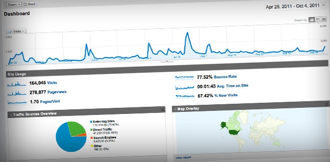
Dashboard
Now that you know what everything means, it’s time to go back to the Dashboard which is the first page that you’ll see when you enter the Google Analytics for your site. As I mentioned before, I like to see the whole timeline of my site on this page as I can quickly hover over the day and find out the number of visitors I’ve had, as well as easily comparing this with the past. You can add and remove different parts of the dashboard, but I always choose to include this.
The next section which I like to see an overview of is the Usage section as it give me a clear overview of all my key facts, as well as small graphs that I can look over to track the progress. Even with them this small, I can still see that my average time on site has gone up, as well as pages per visit, while the percentage of new visitors has gone down. You can also click on any of these links to take you to the right part of the Analytics program.
Then we have the traffic sources and map overlay section. Both of these are better seen in smaller time periods because then you can track more recent progress of how your links are being shared around the world. These don’t really tell you a lot of information so it’s best to click on them and see them full sized.
You can mix and match what you’d like to include from here, but I personally only use the ones listed above because I like to give them a quick glance when I’m visiting my dashboard.
Hopefully you’ve learned something from this tutorial and if you weren’t using Google Analytics, then you should be now. It’s by far the most powerful tool at your disposal for studying the progress of your website and seeing where you can improve.
Related articles
 Making The Most Of The Google Analytics Intelligence Feature
 Make The Most Of A Custom Google Analytics Report & Segments
 Google Analytics Goals – Setup Guide
 How To Track & Improve The Quality Of Your Visitors
![[GET] Polaris for Google Analytics](https://seo.maxiaodong.com/wp-content/plugins/wordpress-23-related-posts-plugin/static/thumbs/2.jpg) [GET] Polaris for Google Analytics
[GET] Polaris for Google Analytics Get Money From Google…
 The Complete Guide To The New Facebook Insights
 16 Killer Keyword Research Resources For Much More Search Traffic
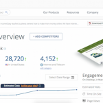 10 Little-Known Ways to See How Much Traffic a Website Gets
 Google AdWords For Beginners: What to Prioritize When Starting Out
 10 SEO Blog Post Publishing Steps that Most Bloggers Forget
 The Ultimate On-Site SEO Guide for Your Online Store