Last week I spotlighted 30 of the internet’s best designed blogs.
A brilliant header, clean sidebar, and minimalist footer can go a long way towards making a blog look good. But the one area that’s often overlooked in blog design is the post styling.
Here are 15 blog post areas that need styling and 30 great examples for you to draw inspiration from.
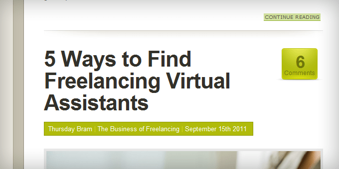
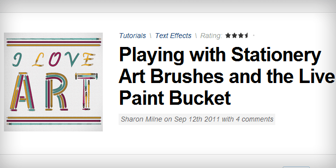
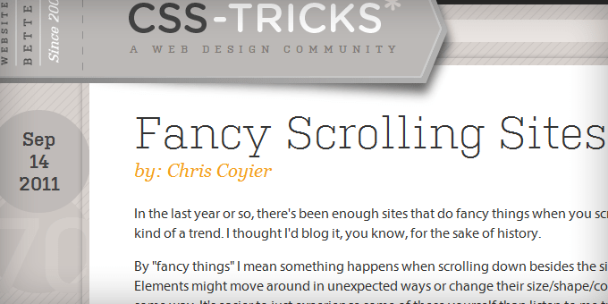
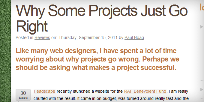
Headlines
The headline should be the first thing they’ll see. The headline and post image needs to work together with the goal of enticing the visitor to read the first line of the post.
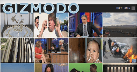
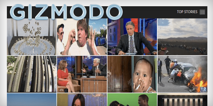
Post Images
If not the headline, the post image is the first part of the post that people see. It needs to attract their attention first, curiosity second.
Breadcrumbs
Breadcrumbs help with navigation and SEO, but most of the time their ugly and unnecessary for people who frequent your site. You want the breadcrumbs to sink into the background of the design so your readers naturally glance over them but they’re easy to find if someone is looking for them.
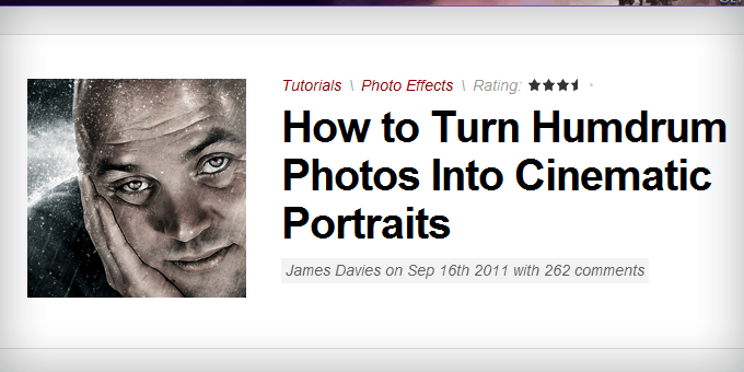
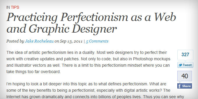
Meta Data
Like the breadcrumbs, you want the meta data (i.e. published on date, post author, category, etc.) to be worked into the design so it doesn’t stick out.
 VisitMix.com
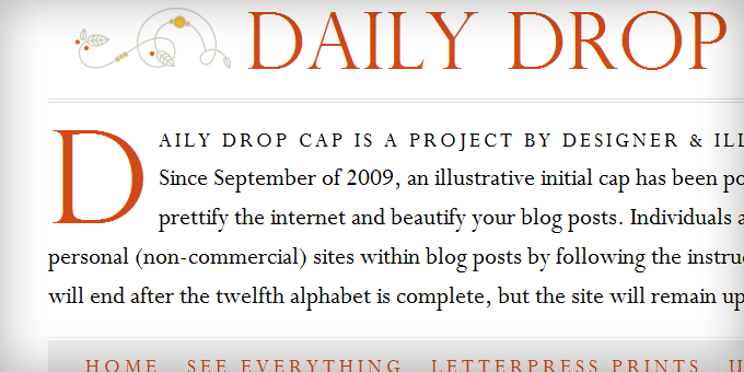
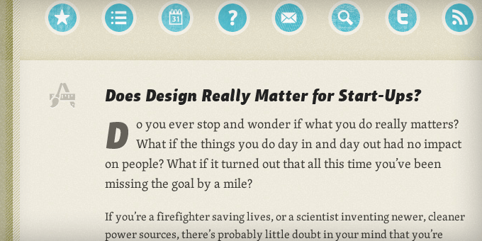
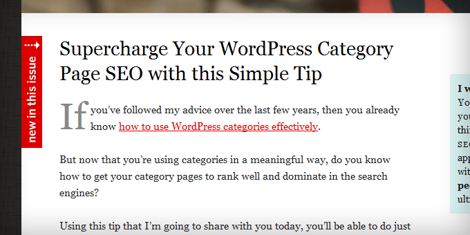
Drop Caps
The point of the drop cap is to immediately draw your readers’ attention to the start of the post. Magazines and newspapers use this all the time and I think more blogs should do it as well.
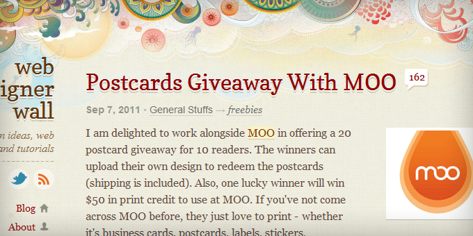
Intro Text
The intro text should be slightly larger and easier to read than the rest of the content so it eases your readers into the post. Magazines use this technique in conjunction with the drop cap to lure in the reader in such a way that it’s hard to stop reading. It’s also called the lead.
 Xheight.co.uk
Typography
Typography’s main function is to make the content easy to read. Most major news sites (i.e. CNN.com, AOL.com, MSNBC.com, and Mashable.com) use Arial because it’s widely considered as the web’s most readable font. But Arial isn’t perfect for every blog.
Subheadings
The point of a subheading is to make your content scannable. These need to be styled so they stick out and break up the content. A good subheading has the same effect as an image within a post.
 DesignInformer.com
Bullets
Bulleted lists are another way to break up your content. With a little CSS magic you can use any image you want as the bullet.
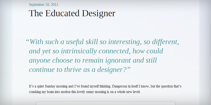
Blockquotes
Blockquotes are traditionally used to display, you guessed it, quotes. But some sites have started to use this formatting to draw attention to a certain part of the post to try to get you to stop scanning and read the whole thing. This is the magazine equivalent of a call out.
 Blogussion.com
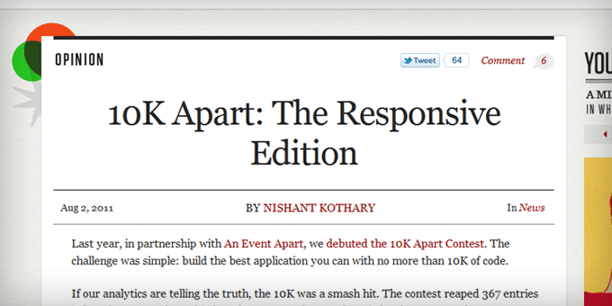
Social Areas
In order to convince people to share your content, you need to style the social sharing areas so they’re obvious and remind the reader to share. I’m a big fan of the sliding social areas that sit in the left margin.
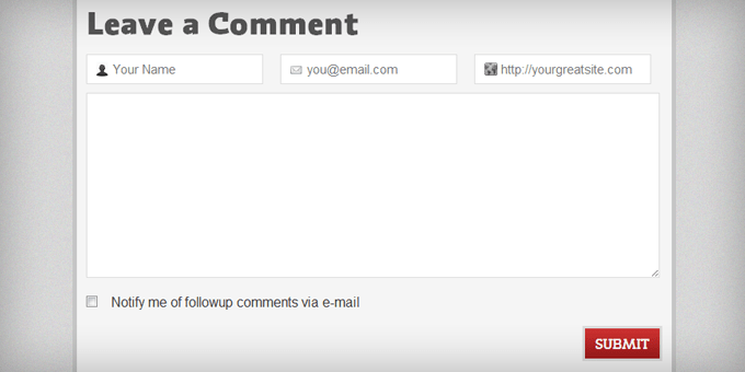
Subscribe/Calls to Action
Every blog post needs to have a call to action. One of the more popular calls to action is to subscribe to your RSS feed or newsletter. It should be the most prominent area at the bottom of every blog post.
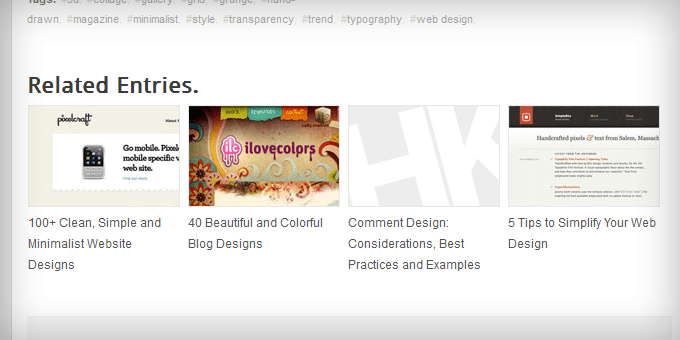
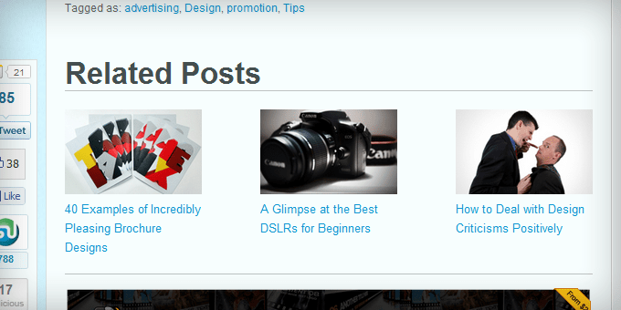
Related Posts
Listing the related posts at the bottom of your blog posts is one of the best ways to convince people to stay on your site. To maximize attention-grabbing and curiosity-inducing, this area should include the headline and the post image for each related post.
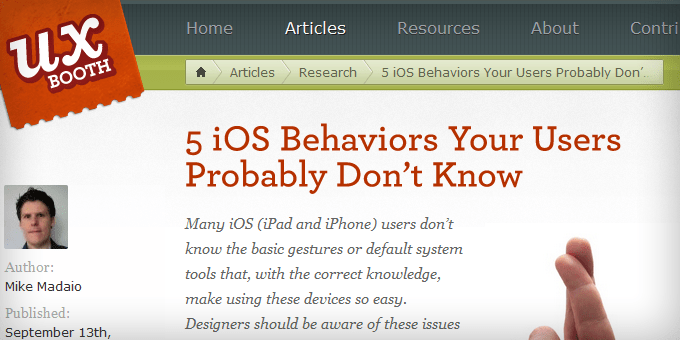
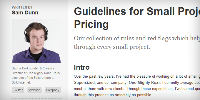
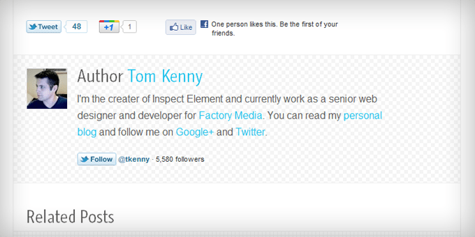
Post Authors
The post author section is a nice way to introduce who wrote the post while making it easy for the reader to connect with that person.
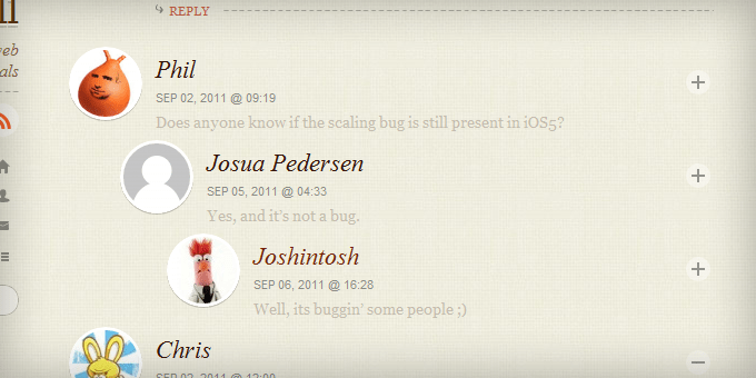
Comment Areas
A nicely designed comments section goes a long way towards encouraging your readers to leave comments. The number of comments, comments, and comment form need to work together. And the comments should be nested so it’s easy to follow conversations.
 Blogussion.com
The Wrap-Up
Since the post area is where most of your visitors’ time is spent, I believe it’s the most important area of the design to focus on.
I hope I’ve opened your eyes to the importance of blog post styling and all the creative ways you can style these 15 elements to encourage readers to spend more time on your blog.
Read more: ’10 Lessons From 10 Years Of Hiring Freelancers’
Related articles
 30 Best Designed Blogs of 2011
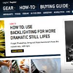 How To Use Photos In Your Blog To Make It More Interesting
 10 Design Elements All Big Blogs Have In Common
 20 Design Features That Will Make Your Blog Stand Out From The Crowd!
 How to Make Your Blog Posts Stunningly Beautiful with Images
 Outsourcing Work on The Internet
 13 Expert-Level Blog Design Tips for Beginners
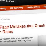 10 Blog Post Creation Tips Every Blogger Should Follow
 How to Write a Legendary Blog Post
 Blog Spring Clean | Things To Remove From Your Blog
 Unusual, Cheeky and Fun Ways To Get Inspiration For Your Blog Posts
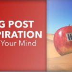 Blog Post Inspiration Is All Around You – Open Your Mind