
Blog design can be as simple as installing a theme and adding a few widgets.
But if you take your blog seriously and you want it to visually stand out, the first step is understanding the principles of design. Once you understand what makes a good blog design, you can work on it yourself or find and qualify a talented designer.
Here are 13 expert-level blog design tips that I’ve gathered from three years of being a freelance web designer. To help illustrate these tips, I’m going to use HelloBar.com’s design as an example.
If you’re not a web designer or developer yourself, but you want a great one who could’ve started yesterday… go to AwesomeWeb.com
1. Make Goal-Driven Design Decisions
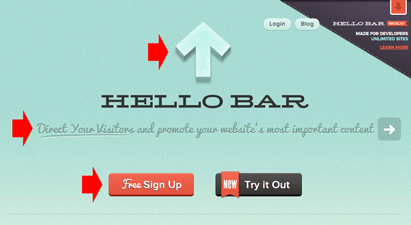
The purpose of design is to get your website to convert towards your goals. That’s it. Everything else comes secondary.
How do you do that?
You need to have a visual hierarchy that leads to a call to action. In simpler terms, feature a headline or a series of headlines that end in a call to action. Then put this headline/call to action duo in the places that people see the most (i.e. top of homepage, top of sidebar, bottom of posts, etc.).

The goal of Hello Bar’s homepage is to get you to “Sign Up” or “Try it Out” and their design makes that obvious.
2. Use 2-3 Fonts, Max
At most, use one font for your logo, one for your headlines, and one for your body content.
Any more and your blog’ll look messy.
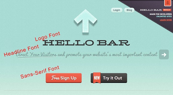
Hello Bar has a distinct logo font, Pacifico headline font, and a sans-serif default body font.
3. Use 2-3 Colors, Max
Your blog should have a primary color, a shade of grey, and a call to action color.
The primary color is the first color you want people to see and the last color you want them to remember. For Hello Bar, it’s light blue.
The shade of grey will help you subtly emphasize and de-emphasize certain aspects of your design.
The call to action color will be used sparingly as, you guessed it, the color you want people to look for when they’re deciding what to do next. For Hello Bar, it’s orange.
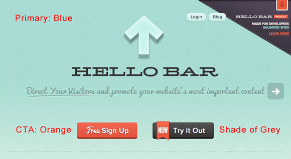
Hello Bar uses light blue, various shades of black/grey, and a bright orange to draw your attention.
4. Pick Perfectly Matching Color Schemes
Along with limiting your color scheme, your primary and call to action colors should complement one another.
To find scientifically matching color schemes, start with your primary color and find supplementary colors with ColorSchemeGenerator.com.
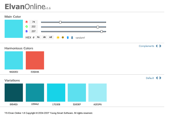
Hello Bar’s blue and orange are perfectly complementary.
5. Cherish Subtlety in Gradients, Shadows, and Textures
Web design is like makeup, less is more. With your gradients, shadows, and textures, make them so subtle that you have to look closely to tell that they’re there.
Subconsiously, you’ll notice that it looks good. But you’ll have to take a closer look to realize why.

If you’ll look closely, there’s a texture in the background, the logo has a shadow, the headline has a shadow, and the buttons have a subtle gradient.
6. Apply Global Light Angles for Gradients and Shadows
A common goal with art is to make it seem as life-like as possible. Web design is no different. One way to do that is to maintain a global light angle across all gradients and shadows.
Think about it. If the sun is shining on a table full of buttons and raised letters, they’re all going to have the exact same gradient-effects and shadows.
Hello Bar uses a 90 degree global light source. The logo shadow, headline shadow, and button gradients are consistently at 90 degrees.
7. Embrace White Space
Aside from effectively using padding and margines, the best way to embrace white space is to simply get rid of everything that doesn’t contribute towards accomplishing your goals.
Do you really need that tag cloud? No, you don’t. Nobody uses those.
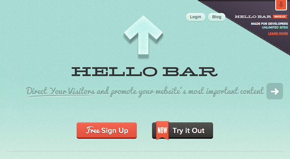
Hello Bar uses “white” space to eliminate all distractions and draw attention to their call to action buttons.
8. Separate with 1-Pixel Borders
Borders help to clean up your design and to visually separate different sections. Use 1-pixel borders because they’re clean and crisp.
Hello Bar uses a bunch of dashed and solid, 1-pixel borders to separate their content.
9. Implement Grid-Based Alignment
This is one of the more complicated tips. Jacob Cass, from JUST™ Creative, introduced me to the 960 grid. It’s a Photoshop template that helps you align your design perfectly and precisely.
Whether or not you use the 960 grid, the different sections, parts, and text blocks in your design need to line up vertically.
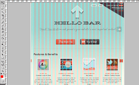
I’m not sure if Hello Bar was originally designed with the 960 Grid, but everything aligns perfectly all the way down the page.
10. Implement Subhead Hierarchies in Your Content
If you want to communicate a series of thoughts or a process (i.e. a blog post), use subhead hierarchies coupled with short body copy to make it easy to move down the page.
From a design standpoint, subheads break up the content but they also make it scannable and easier to consume.
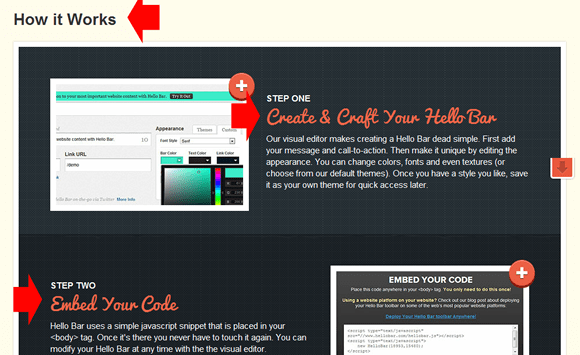
Hello Bar uses a series of well-designed subheads in the “How it Works” section of their homepage.
11. Design with CSS
The process of taking a design and putting it on your website is more complicated than you’d think. In essence, you take the images from your Photoshop file and set them as the background of certain areas with HTML and CSS.
If you have lots of intricate background areas, then this means that you website will need to load lots of images which will lengthen your loading time.
One way to get around this is to design the simple details with CSS. Here are a number of design elements you can add with CSS:
- Borders – {border: 1px dashed #CCC;}
- Frames – {border: 1px solid #CCC; padding: 1px;}
- Text Shadows – {text-shadow: 1px 1px 1px #CCC;}
- Box Shadows – {box-shadow: 10px 10px 5px #CCC;}
- Rounded Corners – {border-radius: 5px;}
You can also use CSS to create gradients, transitions, animations, font-faces, etc., but these start to get complicated and don’t show up in older browsers.
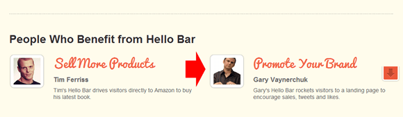
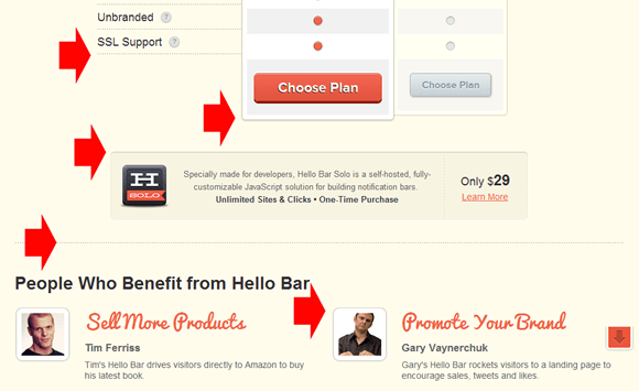
Hello Bar uses padding, borders, and a box shadow to add fast-loading CSS styling to their testimonial photos.
12. Speed Up Your Design with Small, Repeating, Background Images
If you use images to create your backgrounds, make them as small as you can so that they load faster. Then use CSS to make theme repeat-x/repeat-y.

This is the actual background image that repeats horizontally in the Hello Bar background to make the site load faster.
13. Maintain Consistency in Your Calls to Action
My final tip for you is to maintain a consistent design in your call-to-action buttons. This helps people find what they’re looking for. Plus, if they see the same button three times on a page, they’ll notice it and think, “I should probably click that.”
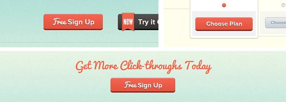
Hello Bar has three primary call to action buttons on their homepage and they’re all styled exactly the same.
If you’ve never checked out Hello Bar, I encourage you to do so. I use it on my blog and it seems to be working well.
The Final Word
If you’re not a designer or coder, I don’t expect you to implement these tips right away.
But once you want to upgrade your design, you’ll be able to ask your designer questions like, “When you convert your PSD to HTML, which design elements do you recreate with CSS so we don’t bog down the site with a bunch of bulky background images?”
On another note, the only rule here that’s unbreakable is #1. The rest are based on best practices and my personal thoughts on design. Bend them as you wish.
As always, if you need more guidance with any of these tips, leave a comment below and I’ll try to help you out.
Photo by: Thomas Hawk
Related articles
 20 Design Features That Will Make Your Blog Stand Out From The Crowd!
 Hongkiat Lim Interview – Quitting Your Day Job To Become a Problogger
 Nate Whitehill Interview – Creating The Perfect Blog Design
 20 Web Design Resources To Help You Build a Great Website
 7 Quick Tips to Make Your Blog Design More Readable
 What to Put on Your Blog’s Homepage
 18 Things You Need To Do To Make Your Website Bulletproof!
 10 Blog Customizations To Make Your Blog Perform Better
 10 Embarrassing Mistakes I Made As A Beginner Blogger
 Blog Spring Clean | Things To Remove From Your Blog
 30 Great Examples of Blog Post Styling
 The Beginner’s Guide To Blogging