What’s the point of your homepage?
If your homepage simply features a list of your latest blog posts, you’re making a big mistake.
It’s important to get your homepage right because it’s going to be one of the most viewed pages on your blog, but people don’t view it in the way that you’d think.
Who Visits the Homepage?
Before you decide what to put on your homepage, you need to understand who views your homepage and how they got there.
First-Time Visitors
You likely think that your homepage is the first page of your website that somebody sees. That’s probably not the case.
The only way your homepage will be the first viewed page is if another site links to your homepage, if someone tells somebody to go to www., or if you have a well-known brand.
On my blog, 14clicks, only 3.9% of my traffic starts on the homepage.
Second-Page Clickers
What’s more likely is that someone will first see a blog post, then click over to see the homepage. This person has already interacted with your site and they’re curious enough to click over to the homepage.
On 14clicks, the homepage accounts for 28.1% of the second-page traffic, which is 3.6 times more than any other page.
Returning Visitors
If someone found your site once, liked it, and wants to go back to it, they’ll do one of two things.
One, they’ll go directly to the domain. Two, they’ll search for the name of your site. In either case, returning visitors will probably start on the homepage.
On 14clicks, 58% of the homepage traffic comes from people typing in the domain directly or from Google (with some variation of “14 clicks” being 5 of the 6 most popular keywords).
In general, people find your site through a blog post. If they like the post, they’ll click to the homepage. If they return, they probably start on the homepage. Therefore, most people who see your homepage have already interacted with your blog and you need to adjust your content accordingly.
Your Homepage Needs to Answer Their First Question
“Why should I stick around?”
To answer that question, you need to communicate what your site is and who it’s for.
Eye-Catching and Concise Headline
The headline should be the first thing a new visitor sees. It needs to answer the question, “what are the benefits to me personally if I cruise around this blog?”
Put your headline front-and-center so it’s first thing someone sees when they visit your homepage.
Eye-Catching Image or Video
On the side of or below your headline, you need to put an eye-catching, trust-building, benefit-depicting image or video.
The purpose of this image/video is to elicit a positive emotional response while visually communicating what your site is all about. If you have a personal branding blog or a company that’s tied closely to your personality, put a photo of yourself on your homepage to build trust.
Good Example: JustCreative.com
Jacob Cass has a picture of himself and his headline featured above the fold. He also uses his headline to direct people to his portfolio and blog.
Tell People What You Want them To Do
After you tell people why they should stay on your blog, you need to tell them what to do next. Underneath your headline and image, put your call to action. This could be one of four things depending on the purpose and goal of your blog.
Request a Quote
If you have a service-based business and you want to use your blog to collect leads, the homepage is a great place to put a button or a link to your contact page.
Subscribe
If the goal of your blog is to get email subscribers, put an opt-in box at the top of your homepage.
If you’re worried that the opt-in box will annoy your existing readers, don’t be. In the same way that you tend to gloss over ads, once they’re subscribed, they’ll subconsciously scroll past it to the content.
Register or Login
If you have a membership site and your number one goal is to turn readers into users, place two buttons as your call to action: “Register” and “Login.”
Purchase Something
If you want to skip the whole email marketing step and go directly for the sale, not what I’d recommend, then you can make the homepage call to action “See Our Featured Product” or “Shop.”
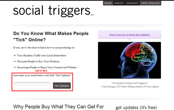
Good Example: SocialTriggers.com
The sole purpose of Derek Halpern’s site is to turn readers into subscribers. So he puts opt-in boxes everywhere, including at the top of his homepage.
Add Credibility and Social Proof
Once a visitor knows how you can help them and what you want them to do, it’s up to them to make that decision. The best way to help them make that decision in your favor is to demonstrate your credibility through social proof.
Social or Subscriber Counts
People are a lot more likely to subscribe if they know that lots of other people are already subscribed.
If you have more than 1,000 subscribers, show that number directly below your call-to-action. If you don’t, you can show social proof with your number of monthly readers, Twitter followers, or Facebook fans. If none of those numbers are over 1,000, you need to get to work.
Show a Testimonial, Preferably from a Well-Known Source
Another way to build credibility is to feature someone else’s opinion of you and your blog. Ask your most active readers to give you a testimonial and tell them that you’re going to put it on the homepage.
What’s even more powerful is a testimonial from someone who everyone knows. This builds authority by association. But don’t coerce testimonials from people who wouldn’t otherwise read your site.
Press or Customer Logos
If you’ve gotten a lot of press or have worked with well-known brands, put their logos on your homepage. Again, this builds authority by association.
I’m torn whether or not you should link the logos to the articles, though. On one hand, it could build your credibility even more if people read those articles. On the other hand, you’re driving people away from your site right as they’re about to take action. What do you think? Comment below.
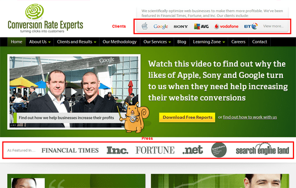
Good Example: Conversion-Rate-Experts.com
Ben Jesson and Dr. Karl Blanks, from Conversion Rate Experts, have worked with the largest companies in the world and their blog has been featured on a number of prestigious media outlets. They make that clear with client logos and press logos (which aren’t linked, by the way).
Regularly Updated Content and Deep-Linking for SEO
From a search engine optimization perspective, there are two important things to consider with your homepage.
One, your homepage should update at least slightly when you post new content. Google likes to see fresh content. Two, every page on your site should be two-three clicks away from the homepage to make sure it gets completely indexed.
Links to Latest Blog Posts
New content on the homepage, even if it’s just the headlines, is important for search engines, but it’s also important for your readers. When people come back to your blog, they’re expecting to easily find your latest content.
This doesn’t mean that your blog needs to be on your homepage. You can choose to use a Recent Posts plugin to display the headlines and excerpts from your latest blog posts.
Deep-Linking and Sitemap Link in the Footer
The best way to make sure that every page on your site is within three clicks of the homepage is to subtly link to your category archives and sitemap in the footer.
This also helps from a usability standpoint if people are looking for posts on particular topics.
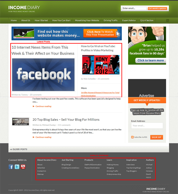
Good Example:
As you see, Michael showcases the latest posts on the Income Diary homepage because his goal is for you to consume as much content as possible. The more blog posts you read, the more likely you are to subscribe and buy something from him. In the footer, he links to the sitemap, category archives, a few popular posts, and author archives.
The Final Word
Blogs are different from traditional, static websites because almost everyone who sees your homepage has already seen a different part of your blog.
It’s important to adjust the content of your homepage knowing that they’re already interested in what you have to say. Whether it’s leads, subscribers, or sales, the homepage is a great place to convert people to whatever goals that you set for your blog.
How does this help you see your homepage in a new light? What are you going to do about it?
Photo by: Stuck on Customs

