Making the most money from a site without selling out or making your site look bad is important to me. More money means I can invest more, buy premium domains, hire SEO, design, programming, copy guys, anything I can do to improve my website.
I like to funnel people through my website, I like them to feel that the way they use my website is natural, they go here, then here and then end up buying something if they feel it’s right for them. I think most people get monetization wrong because their first thought is to monetize, that’s probably why people don’t stay long enough on their websites to earn them any money. Make your website inviting, make it easy to navigate and then once you impress them, that’s when and where you monetize. I hope you enjoy today’s post, please leave a comment and let me know what you think you could be doing better, or better yet, what you are already doing that’s working well for you.
7 Design Tips That Will Make Your Site More Money!
Top Navigation
This may seem odd to a lot of people, how can your top navigation effort your earnings? It’s because if you send visitors to pages that make you the most money, then you will make more money. The best way to show you this is to explain my navigation:
- How I Started – it’s about how I started and how you can two, monetized with affiliate links.
- How You Can Start – Most common asked question, monetized with affiliate links promoting the tools I use.
- Make Money – category of all posts related to make money, most are monetized, very popular subject.
- Driving Traffic – same as above, popular and well monetized.
- Blogging Resources – my own products and product I recommend
- About Us – a page to promote my business and my writers so that they get a further reward for writing for me. If they didn’t write, I’d get less traffic, so it’s a trade of. Exposure for traffic which in turn makes me money.
Another factor is the text you use, not just the link, if your link says for example About, it’s not going to get as many clicks as My Story, to further increase clicks, I changed it to How I Started. The links have to make people want to click them, a link saying Product isn’t advertising, Blogging Resources is.
Before I made a recent change to my navigation, I was sending nearly 4,000 people to a page on my website that had no real benefit to the reader or me, I’ve since changed it and have seen an increase in page views and earnings. Have a look at your top navigation right now, do you have enough links? Do they make you want to click them? Do those pages either inspire or make you money? If it doesn’t, fix it! You may need to publish new content to link to, this was the case for me.
Advertising Different Products in Different WordPress Category’s
Way back, around three years ago when I was monetizing a blog I had in the web design industry, I was struggling to show targeted affiliate offers. Someone reading about Dreamweaver, probably won’t be interested in products about Photoshop, it’s a different type of web designer. What I did was using one line of code, I showed two different adverts, one in the Dreamweaver category and one in the Photoshop category. To do this, you need a real basic knowledge of code, or just ask your web guy to do it, here’s the exact code I used all that time ago.
Plain Version:
<?php if ( in_category(’6?) ): ?></p> <p> // Some category specific PHP/HTML here</p> <p><?php endif; ?><br />
Actually Code From My Site:
<?php if ( in_category(’4?) ): ?><br /> <span class=”red_normal”><b>New! </b></span><b><a href=”http://webdesignd.lpnow.hop.clickbank.net/” mce_href=”http://webdesignd.lpnow.hop.clickbank.net/” target=”_blank”>Photoshop Video Tutorials</a> – You Are About To Discover The Fastest Way To Master The Basics Of Adobe Photoshop (With Just 2 Hours Of Instantly Viewable Video Tutorials).</b><br /> <?php endif; ?><br />
This isn’t just going to make you more money but it makes your site “make more sense”. It can be confusing to see unrelated adverts, most would see it as selling out or trying to hard to earn every penny possible.
My Story Box
Your about page should really be your “who you are and what can you do for me” page. I call it a My Story page, it should educate them about what you do and how they can do it themselves. Yo then monetize it with affiliate offers and perhaps a training program which can take them further which obviously makes you money if they buy. Because of this, it’s one of your most profitable pages, either they buy there and then or because they get to know you and buy from you in future. Making sure the most amount of people visit that page is in your best interest and so having a big box with a bold headline in the top right corner is vital.
Your about page earns you money in other ways, if people like who you are, they will link to you or do an interview with you. This will bring more traffic which in turn, earns you more money. You can also get seen by the press or asked to speak at events.
Header Advert For Maximum Exposure
Just below my top navigation I have a bar which promotes other pages on my website. I know which pages make me money, specific guides and reviews. The more visitors I send to those pages, the more I will earn. This is the highest click through area on my blog. Second is the top right but it hugely depends on the size of the advert. Utilize this spot if you want to direct more traffic to your highest earning pages. This will ultimately end up with you earning more money.
Lightbox Optin, Powered By Popup Domination
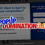
Most of my regular readers will know just how important this is. More subscribers, means more money, the problem with typical lightbox opt-ins is that they are ugly. Last year I launched a new software called Popup Domination which has a standalone version and WordPress version. It allows you within a few short steps add a well design lightbox to you site. One of the most important things about it is the design, everyone uses it because it converts but also because it makes their site look great! Below is a preview of what it looks like, it’s a javascript popup which comes up over the website, it’s part of the page and people can simply click the X to remove it. This increased my subscribers by over 500% literally over night!
Check out Popup Domination to create your own lightbox!
Featuring Your Best Content
Most sites have featured content on their sidebar, often seen as popular posts. This section is used to show your most popular content but also the content that makes you money. I have it split into three sections:
- Inspiration – top lists that inspire people to take action.
- Interviews – inspires people but I also get the chance to promote interviewee’s products.
- Guides – my best guides, all well monetized with affiliate promotions.
If they like just one post on your website, it’s likely they want to find more, this widget is really important for making it easy for readers to do exact that, find more great content which means you will earn more money. Most premium WordPress themes have something similar built in, check out the Busybee theme by Woothemes.
Squeeze Pages To Get More Subscribers
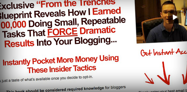
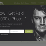
I build my list in two ways, with a lightbox popup and a squeeze page. Personally I don’t believe you need anything else, that includes a sidebar opt-in. You see the lightbox get’s you the bulk of subscribers, however some may not see it or decide later on that they want to subscribe, this is why they visit the squeeze page. Another reason for a squeeze page is they are easy to share, if people love your list, they can say, they can send a friend to the page so they can opt-in. If you simply just have a subscribe box on sidebar, they can’t direct them exactly where to opti-in. One thing I do is in my most inspiring posts, I’ll link to my squeeze page and mention, want to follow in this persons footsteps, click here and then I direct them to the squeeze page.
To create well designed squeeze pages with no technical or design knowledge, check out OptimizePress!


