We have been building email lists for over 11 years now and it’s not only one of my favorite ways to make money, but it’s also a great way to drive traffic instantly to your site. Over the years, we have had 100,000’s of people sign up for our mailing list, so today I thought it would be a good idea to share with you what works best when trying to build a mailing list.
You ask any top marketer, what is their most important marketing tool, they will tell you it’s email.
Why?
Because nothing is as consistent as email marketing.
With the click of a button, you can instantly send an email to a group of people with your offer. You don’t have to wait for them to come to you. They have already shown interest and want you to email them.
Take a look over the last 10 years.
Google Adsense was the go to way to make money from a website. You could earn over a $1 a click. Some people made as much as $25 a click. It was brilliant. People coming to your website didn’t even know what the ads looked like and would click them all day long.
As time went on, more websites used it, with more people offering clicks, the earnings per click went down. Web users learned what ads looked like and stopped clicking them as much. Google’s terms got more strict. Eventually website owners started looking for something new to make them money.
Then came Text-Link-Ads.
Website owners used this site to sell text links on their site.
A large part of Google’s ranking algorithm is based on how many quality links you have pointing to your website. This meant big companies were happy to pay a premium to get links, to push up their search engine rankings, getting them more traffic and making them more money.
You could add 10 links to your sidebar and make $1000/month.
Even sites with low traffic could charge a lot for links because people weren’t buying links based on traffic, but how much Google liked their site.
Google hated this.
Google wants to show users the best possible match for their search. Not those who cheat the system.
As time went on, Google started punishing sites who bought and sold links. Quickly the price of links dropped and everyone was left looking for a new way to make money.
When Twitter came along, website owners could sell promotional Tweets to their followers. Over time, quite quickly in fact, Twitter became to busy, there was to many people competing for attention, Tweets started to perform less and thus, people stopped buying Tweets.
There are dozens of examples of monetization techniques making people rich, but over time… stopped working.
Email marketing has remained consistent. That’s why top marketers focus on their list above all else.
Even if email dies one day… marketers will still focus on their lists. Before email, marketers would send letters in the post. After email, who knows how they will contact their list, but there will be a way and it will continue to perform.
That’s why you should focus on your list.
How To Grow Your Email List
Over the last 11 years, we have tried and tested dozens of different techniques to build our list.
We wanted to know what are the best ways and in what order do they perform.
So over the last two weeks, we tested the 5 most popular ways to show signup forms on a website.
They are:
- The top of the homepage
- Bottom of posts
- Sidebar
- Squeeze page’s
- PopUp’s
Below is a breakdown of how well they did.
Before you continue, take a minute to think, in what order do you think they came?
The Results
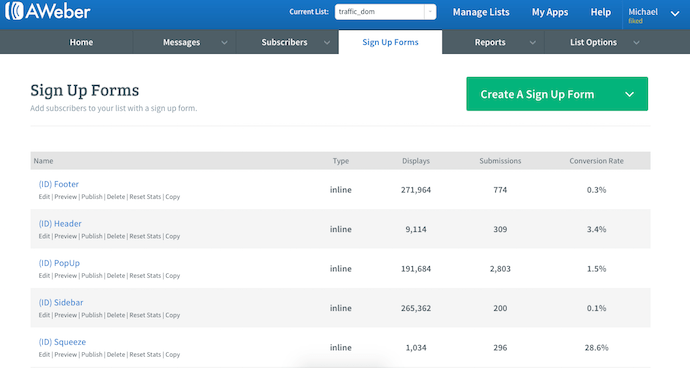
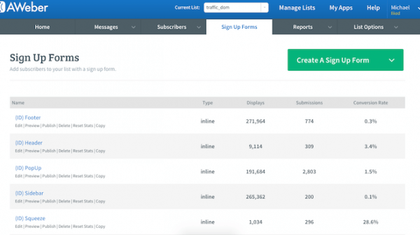
Total new subscribers: 4382
- PopUp Domination brought in 2,803 new subscribers – 63.9%
- Footer Signup brought in 774 new subscribers – 17.6%
- Homepage Signup brought in 309 new subscribers – 7%
- Squeeze Page brought in 296 new subscribers – 6.7%
- Sidebar Signup brought in 200 new subscribers – 4.5%
All 5 techniques were active at the same time, competing against each other.
It’s worth mentioning that all of our traffic for this test is from free traffic sources, interested in a wide range of subjects. (which explains our low conversion rate)
Continue below to see a breakdown of why they performed the way they did.
Getting Email Subscribers From a Homepage Header Box
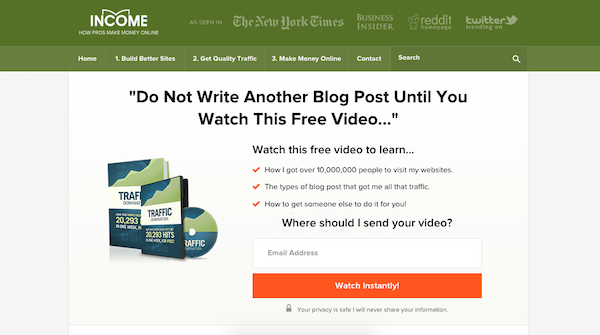
We first added an opt-in box to our homepage back in 2007.
In 2009 we decided to try something bigger, we added a full width opt-in box right under our header.
Overnight we saw a huge increase in new subscribers.
At the time, hardly anyone was displaying opt-in boxes like this. Now you see them everywhere and for good reason.
Most people who visit your homepage will come from other pages on your website. They come to your homepage because they have seen something that has made them interested enough in you that they wanted to stay and look around. Because of this, your homepage is one of the highest converting pages on your website.
Getting Email Subscribers With Below Blog Post Opt-in Boxes
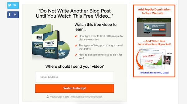
Having a subscription box below blog posts is a good idea because visitors have just read your post. Your post has just sold them on who you are and the value you can deliver.
Placement is everything. The difference between putting this box at the bottom of the page and the bottom of a post can be as much as 500%.
Getting Email Subscribers From Sidebar Signup Forms
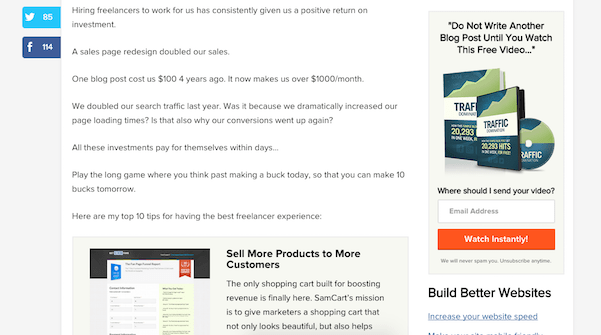
The sidebar is probably the most common place you will see an opt-in box.
It’s also the lowest converting signup form on our site.
Why is this?
Could it be because you have less space to promote your offer?
Is it because people are use to seeing it and switch off?
Or perhaps it’s because all the other techniques grab their attention first.
It performed so badly for us that we have decided to delete our sidebar signup. It isn’t worth it. It takes up a lot of space that could be better used to direct people to more content. The more content users see, the more opt-ins we get and the more sales we make.
Getting Email Subscribers From Squeeze Pages
Every website needs a squeeze page.
It’s a page that’s soul purpose is to promote your email list.
You can link to it in posts, emails, adverts. Subscribers can use this link to tell their friends how good your emails are and to go here to sign up.
Often, I will be writing something and want to reference my mailing list. It’s a lot easier to link to your squeeze page then to tell a reader the location on a page to go to and sign up.
Use Optimizepress to create high converting squeeze pages effortlessly.
Getting Email Subscribers From PopUps
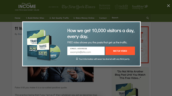
The almighty popup. Just 5 years ago it was rare to see one. In 2015, they are used by the majority of websites.
I’m sorry.
A big reason for that is because of us.
Five years ago, I was having a conversation with a guy at an event about how his site was using them to get email subscribers. It was by far the most powerful tool he was using to skyrocket his mailing list.
I wanted in.
I searched for an easy way to add a popup opt-in box to my website. The best I could find was a simple white box which would only allow me to edit the text.
But I wanted a popup that looked and converted great!
So as soon as I got back from the marketing event I spoke with my designer and asked him to make me one.
Overnight our email subscribers jumped by over 507%.
OVERNIGHT.
Never have I seen something blow up so quickly.
I was now getting as many new subscribers as the big guys in my industry but with a fraction of the traffic.
On a call the next day, I told my designer about the results. I dropped the suggestion that it could be a good idea to go into business together and build a WordPress plugin so that other websites could easily add a popup to their site. He would supply his web development team and I would bring my marketing skills.
I did for a brief moment think to myself, perhaps it’s not a good idea to release this because it works so well. Perhaps I should keep this to myself, my secret edge. But I knew it would be big and if I didn’t do it eventually someone else would.
We worked round the clock for 11 days to build the first version. A time frame we gave ourselves because we were concerned that another marketer was working on a similar project. In the end, they were working on something else.
In our first week, we sold over 500 copies.
At the time, a lot of top bloggers spoke publicly about how they didn’t like it and were against us. Now they all have popups on their sites.
Over the years that followed we have invested 1000’s of hours on development.
Today, over 60,000 websites are actively using our software.
What you need to know about PopUps
It’s the No. 1 way to build your list, by far!
Why?
Because it’s kinda hard to miss.
You see it before any other signup form.
So how can you get your own and what’s important?
Go to PopUpDomination.com and download our plugin.
(Look out for a major/huge/gigantic update coming soon. Something cool is coming.)
As for tips for getting the most out of your popup:
Test everything.
Try different popup designs, colours, copy and promotional images. Split test something new every week to increase conversions.
Display different popups based on category. If you have one popup, not every reader will be interested in what you have to offer. Setup different offers for each category to put your email marketing on steroids.
Display settings matter. Work out how often to display your popups and after how many pageviews/seconds on page.
That’s it.
If you can only use one email marketing technique on your site, you should be using PopUp Domination.
