I’ve been using PopUp Domination since I first started online, in early 2011, and since then, I’ve amassed a list of over 20,000 subscribers, most of whom signed up using PopUp Domination.
Since the early versions of PopUp Domination, the plugin has grown to include more themes, as well as shortcodes so that we can enter subscription forms about our website, such as in the footer and sidebar.
I use various themes from the premium theme pack at once, so that I can convert the most amount of visitors possible, while keeping the offers relevant.
It’s helped me to build multiple lists, so I’ve written this post to show you the different ways I use PopUp Domination.
It may be more powerful than you realise – I use 6 different popups at once.
Exit OptIn PopUp
This is my go-to pop up, and where most of my opt ins come from. I’m constantly updating this with one of the 25+ themes available, to see which provides me with the best conversion rate.
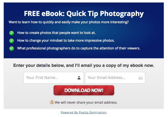
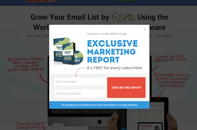
It’s set so that when you leave my page, the pop up appears, asking for your email address in return for a free ebook.
I A/B tested it earlier this year, and I found that I got a better conversion rate by asking for people’s email addresses as they were leaving, rather than when they land on the page.
It makes sense really because when they’re arriving on the page, they’re looking for something, and when you display a pop up straight away, they’re more likely to get rid of it and find what they came for.
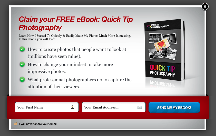
“Image On Right”
A/B Testing
Always be testing.
There’s always unlocked potential in your opt in pages and pop ups, but you never know what’s going to convert best until you test it.
I initially tested a few different themes against each other, but when I found one I liked, that seemed to convert well, I then switched by making adjustments to one theme.
I test colour, heading, length of bullet point, and my favourite point of all; button text.
Sidebar & Footer OptIn
With version 3 of PopUp Domination, you can now do in-post opt ins, by taking a shortcode, and inserting it wherever you like.
I use a sidebar opt in, using PopUp Domination, as I find that they convert well and they’re well designed, especially in comparison to Aweber‘s templates.
I also use a free plugin called Q2W3 Fixed Widget, to allow my sidebar items to scroll with the page.
Again, this helps to remind people that there’s a free gift waiting for them, and encourage opt ins. My income comes from my list, so I prefer to advertise that, rather than an affiliate product.
I also use the shortcode to enter a form at the bottom of every post, like so:
Exit PopUp Notification for Sales Pages
People leave your sales pages for a variety of reasons, but whatever that reason may be, don’t you want a final chance to display a message to them and entice them back into your page?
That’s what I do on my sales pages.
It’s just a really simple popup with a list of benefits that they may have missed. If you present this to them in a really easy to read manner, there’s a good chance they’ll come back and have another look.
Instead of collecting email addresses, we just have a link to the page, or the cart, depending on the product.
This has been a proven method to make more sales for us.
“Get This PopUp”
Video PopUp
Sometimes, video just works best.
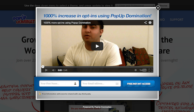
I have various video sales letters, from the short and sweet, to the 15 minute long informational videos, and it’s good to be able to display these videos on relevant pages.
For example, I recently created a 7-day video course, for free, to help promote my paid course. I had a video popup appear to visitors on the pages where the topics were mentioned, asking them to opt in.
This way, I can talk to them through the medium they will expect to see me though, and I’m only targeting relevant content.
It also means that I can use my regular pop ups on the other pages.
“Video PopUp 1”
Redirection Pop Up for Posts Related to Products
My front-end video course for amateur photographers covers about 25 different posts on my website. They were simply adapted into videos and sold as a package.
Because I already have written versions of these videos, I can then go back and target those posts with my popup.
I do this by adding them all to a single category, and then making the popup appear on pages from that category.
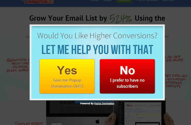
There’s already an ad inside each post, but the popup appears as they enter each page, which helps to encourage them to view my paid product.
I find this kind of popup works best on page load because I can show my visitors the alternative, before they’ve even started reading.
“Yes or No”
For Establishing Interest in a New Product Idea
This is an awesome trick, if I may say so myself.
I’m testing the market for a new course on composition, because it’s not worth me creating the course until I know whether there’s interest or not. Otherwise I’ll do months of work, for very little return.
I create a popup with a similar offer to the product that I’m going to create.
For me, I’m thinking about creating a photography composition product. So I created a popup, offering a free composition video I’d made, in return for their email address. Then I go into the Analytics in PopUp Domination and look at the conversion rate. If it’s good enough, I will create the course.
And if I do launch the course, I have a list of potential buyers.
I only make this popup appear on the composition category.

“Countdown theme”
Earning Money with An Affiliate Link
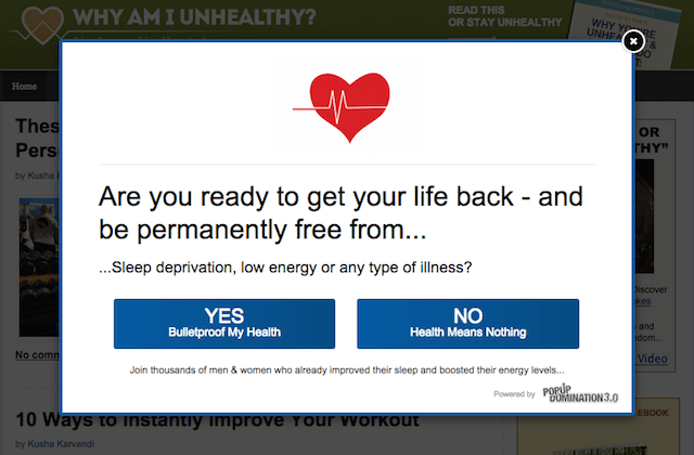
If you have a Clickbank account, you can start earning an affiliate commission on PopUp Domination with about 15 seconds worth of work.
You simply go into the affiliate settings, and enter your Clickbank username.
Now, not only are you collecting emails with PopUp Domination, but you’re advertising an affiliate product too.
You can view the affiliate information here.
“Yes/No 2015”
Affiliate Contact Form PopUp
I use this pop up as an exit popup on my contact page, and an entrance popup on my affiliate page.
I’m always happy to have other people promote my products for me, and if I’ve managed to get them to go to a page where they might sign up, I want to do everything I can to get their contact.
My pop up is really simple, and looks like the image below, only with a couple changes.
I ask for their name, email address, website, and online following.
In the bullet area I include demographic information, earnings per click, and information on promotional material, such as banners and email copy.
I also have PopUp Domination notify me whenever anyone signs up to the list, so that I can go and check it out, and get in contact with them.
The reason I use a list, rather than a regular contact form, is that I then have a list of email addresses I can easily send information about product launches, special offers, etc.
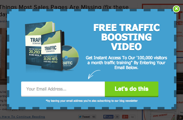
“Subscribe Clean 5”
Analytics
If you work online, and you don’t know your data, then you’re just lazy.
One of the key ways to earn more money is to improve your conversion rate for more leads, or sales.
So for that reason, every page that could potentially lead to a conversion of some kind, is always being tested, and I’m always looking at the analytics.
PopUps are an incredibly powerful too, but you’ll never know how much powerful it could be, without the use of analytics.
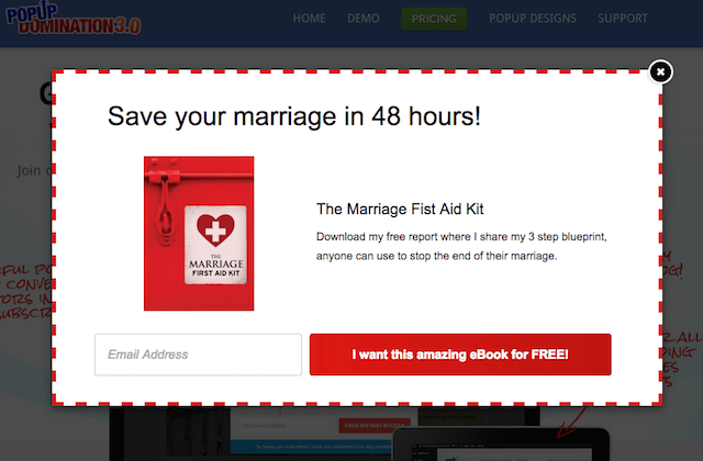
“Subscribe Clean 4”
Click to Display
PopUp Domination came out with an update allowing our lightbox popups to be triggered when a user selects an object such as a text link, video or an image. The “Click to Display” feature allows you to highly target your offer, segment your lists, and most importantly it’s less likely to annoy potential subscribers.
These are 7 ways I like to use the Click to Display feature:
- Sidebar optin button.
- Squeeze page optin button.
- Within blog posts when mentioning email lists.
- Product images for a pre-sale list.
- New “revealing” videos.
- Custom ads.
- Image of my flagship free report.
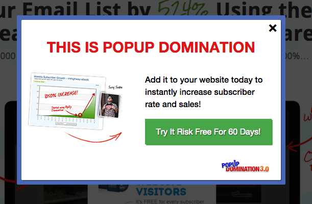
“Page Redirect 3”
Tab Display
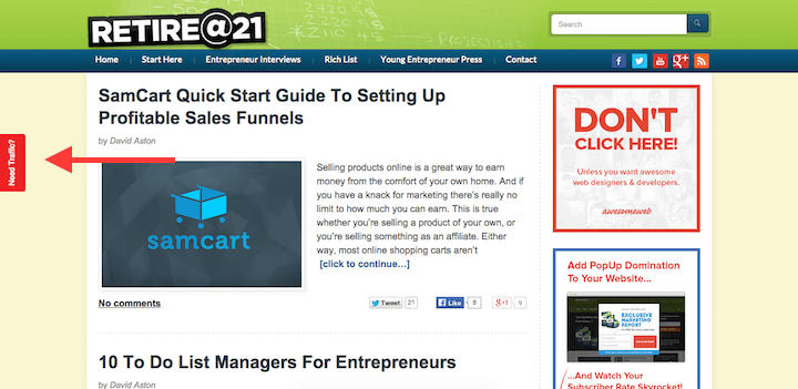
The tab display is cool because it results in increased conversions and more trust with your subscribers. Tab display also makes the customer feel like “they’re” in control. With the tab we’ve got setup on RetireAt21.com (see screenshot below) it discretely suggests improved traffic by clicking the link. Users are more likely to trust this approach and take further action when you have a beautiful PopUp following the clicked tab display.
List segmentation is cool for a few reasons.
The business’ main source of income comes from my list, so it makes sense for me to do everything I can to build on this list.
You may consider me to be bias, as the product was created by my brother, but I can say for certain that my business would not be where it is now without the use of PopUp Domination, and the premium theme pack.
Along with OptimizePress, this is just one of the plugins that are essential to my business.
You can also follow PopUp Domination on Twitter.
