Introduction
If you really want your blog to excel, you shouldn’t just set it up with a plain WordPress theme and leave it at that – the beauty of WP is the ability to create much more interesting websites with the ease of clicking a few buttons. This post is all about making your website better with just 10 easy customisations.
Header
The first thing any visitor sees when they enter the website is your header, so there’s no excuse for not having a good one. Depending on your niche, you can add different elements to your header to make it stand out from your competitors, for example, I’m in the photography niche so I added a couple photos and a little bit of writing about them. Beneath that is the links to different parts of my website, customised so that they’re unique to my blog, and are in keeping with the rest of my theme. When you compare my blog header to that of a very similar blog, who are using the same theme, and have been round a few months longer, it’s easy to see which is best. I personally really don’t like having adverts in your header, I don’t know if it makes the website a lot of money, but I do know I’d never put one there – your website is judged on first impressions, make it count.
Logo
We’re currently in the process of finding a logo for our website, but first of all, I need to find some ideas that I like that haven’t already been taken, or are completely cliche. Just like the header, appearance is key, and a good, strong logo, makes your website look even more professional. It helps to have some elements relevant to your niche, but in the search for a good logo in my niche, that’s not what makes a good logo; more often than not it’s the typeface and style. From my list of top 20 photography websites, here’s my most and least favourite logos. Let’s look at the PopPhoto one first, it’s bold and strong, with good colouring which doesn’t distract the reader from the text. When you look at the ePHOTOzine logo by comparison, the bad font and dodgy colouring makes it look it was found in popart.
Slider
I really can’t stress how important it is to have a good looking slider on your homepage, they’re incredibly useful and of course, makes your website look really good. I’m pretty picky about the look of my website, so we looked around for quite some time before choosing the appropriate slider, and actually ended up buying one called uBillboard, which is completely customisable and one of the best that I’ve seen – it only cost $20. The featured slider not only allows you to plug your latest tutorials, but all the old ones that you know are great, but nobody seems to be reading because they’re lost behind pages and pages of other tutorials. For $20, this is one of the best customizations on my website.
Social Bookmarking
I’ve been working on our social networking since day 1, but we only recently added the Sharebar widget to help with our social networking, and it’s already made a noticeable difference. The day it went up, we received 10 tweets of our content all with the tag @photojosh, so not only was it sharing our website, it was sharing our Twitter, which links to our Facebook, which then brings everyone directly back to our website. You have the ability to add loads of different options to your Sharebar, but to make sure it’s not too intrusive, we only include Facebook, Twitter, Google+ and StumbleUpon. The bar slides up and down the page as you scroll, so it’s always there as a constant reminder for people to share content that they enjoy, which is a huge help to a starter site like mine.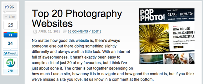
Related Posts
Very recently, I’ve added a related post feature to the bottom of each of my posts to help improve my bounce rate and pages/visit ratio. I’ve had trouble finding a plugin that I really like, and i’m still not entirely happy with the one that I’m using, but I’m going to keep looking around for one that I really like. For now, it does the job very well, I’m just a bit of a perfectionist. The related posts are at the very end of the post so it’s targeted for readers who will actually read the whole of the post and make it towards the end, which is exactly what I want. If they’re not interested in what I’m writing then it makes no difference to me if they’re on the site or not, I need regular followers who are looking to learn.
SEO Smart Links
This is one of my favourite plugins because it’s takes away so much potential work, all you have to do is assign keywords to different links and this plugin does all the work for you. When you know your keywords, you can start using them more often to link your readers all over your site, improving your bounce rate and pages/visit ratio. Every couple of weeks I will post a tutorial with a list format, which is full of good information, but the primary reason for writing it is so that I can link to lots of my tutorials, and any new readers can have a look at what I have to offer. These are usually very successful posts and help to build my following without having to do any of the hard working of linking every single link. You can change the settings of where you want the posts to appear and how many times they appear in each post, helping you to produce the best results.
About The Author
This plugin is half for the user, and half for me. I feel it’s important for the reader to relate to me as a person, rather than ExpertPhotography as a website, as they’re more likely to interact when they realise there’s a person behind the website rather then just a computer. A little bit of personal information goes a long way as the reader will be able to relate to you and is more likely to come back in my opinion. I think Michael has done a very good job of being the face of this website, so much so that at least half of the comments on my posts on this website mention Michael, rather than Josh. This is all part of becoming recognised as an authority in your niche and furthering your career because of it – your name should be synonymous with your website’s name.
User Forms
A great way to encourage user interaction is t0 have a user submission form for your readers to submit their own content, no matter what your niche is. My niche is photography, so my form is an obvious one, it’s a photo submission section. Not only does this help to build content for my website, but the readers feel involved and get recognition for their work, which as the same time, encourages other readers to share their work. As someone who creates almost all of the content on my website, I’ll tell you it’s not an easy thing to do and the sooner you can get other people involved to help you for free, the easier your job gets.
Image Slideshows
I’ve always been one to use photos on my blog posts, and not just because I write a photography blog as I explain in this article. Images are an excellent way to get your point across, and slideshows are very good at effortlessly providing comparisons and ranges of images. I looked around for quite a long time for a good slideshow plugin and I settled on oQey Gallery as it had the smooth finish and thumbnail tab that I was looking for. Everyone likes to look at photos, myself especially, so if you can find a way of including them, then your going to find your readers are much more interested. Slideshows are particularly useful because if someone is on a slow internet connection, you’re not waiting for multiple photos to load all over the page, they’re only waiting for one image effectively.
Popular Post Sidebar
Finally, as an extra push to encourage your readers to stay on your site a little bit longer, I recommend that you include a sidebar full of popular, relevant or recent posts to entice your visitors. This sidebar can be as long as you want, in fact if you’re writing a lot of content, the longer the better, as your readers are likely to make it quite far down the page. On my website, it’s automatically set up to show you the most popular posts, but I prefer what Michael has done on this site, where he’s customised it with posts he knows are popular and wants to plug. This is very effective and something that i’m going to try and implement on ExpertPhotography.
Thanks for reading and as always, if you want to read more by me on ID, click here, and you can check out my website here.


