So now you’ve launched your very own product/service.
You’ve got your slick sales page up and running.
You’ve emailed your list, tweeted the link, posted the promotion on your facebook wall, scheduled a few webinars, published videos, set up some ads…
But it only resulted to sales far fewer than you imagined.
Put simply, you’re getting a lot of traffic but your conversion sucks.
What happened?
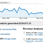
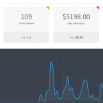
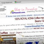
Wouldn’t it be awesome if you were converting more like these websites:
[/caption]
It’s not because these websites have super powers or because they’re using magic voodoo tricks. It’s simply because they’re doing things that you’re not doing – yet.
Conversion Optimization involves many things: market intelligence, developing hypotheses, split testing, measuring results, web analytics, etc.
In this article I’ll make things simple and give you 7 easy tips that if you apply to your sales process, will surely help improve your conversion rates.
1. Cover the Basics!
Just like you shouldn’t wear your pants before your underpants, it’s better to optimize your conversion rate after you’ve got the fundamentals right.
Start by ensuring your sales page or website is functional and accessible.
Functional
At bare minimum, make sure your site:
- Loads quickly
- Has no broken links
- Has a shopping cart that takes payments hassle-free and glitch-free
- Has data-capture forms that actually work (lead generation forms, ‘contact us’ forms, ‘request for proposal’ forms, etc).
Lets not forget about the backend and ‘customer fulfilment’ sides of your business; if a payment goes through but nobody in your team gets notified (due to a technical glitch or misconfiguration in your ordering system), you won’t be able to fulfil the order which could result to very unhappy customers. Not cool.
Accessible
Website accessibility refers to things like:
- The readability of your content. Evaluate your choice of font, font size, text color, background color, contrast between elements, etc.
- Site compatibility with popular browsers, including mobile devices like tablets and phones
- Loading times for different internet connections – will the dial up users in your audience have problems loading the site?
2. Know Who You’re Trying to Persuade
Ultimately, conversion optimization really boils down to how well you can persuade your prospects to take the action you want them to take. But you won’t persuade these people if you know jack shit about them.
Knowing the people you wish to serve is elementary stuff but are you really learning about them? Or are you just making assumptions, imagining what they must be thinking, arrogantly believing you know exactly what’s going on in their heads?
Go find out as much as you can about your niche market. Let’s say that your niche are Nazi-loving, one-armed, pregnant hermaphrodites (by the way I’m the market leader in this fast-growing niche so don’t even try to steal this from me). To effectively convert them into buyers, you must find out:
- What keeps them up at night?
- What’s their wildest fantasy?
- What are their biggest questions, their deepest fears, their worst doubts?
- What conversations are they having inside their head?
- What keywords are they typing in the search engines?
- What websites do they visit and why?
If you knew the answers to these questions, then:
- You would be able to come up with effective hooks to get their attention.
- You’d be able to produce the type of content they’d devour and pass on to their peers.
- You’d know exactly what questions they’d be asking at which stage in the buying cycle – and so you’d know how and when to answer.
- You’d be able to say the exact words that would trigger the needed emotions to help them decide and take action.
- You’d be able to put together an offer they simply won’t be able to refuse.
Conversion Optimization goes beyond the demographics and psychographics. If you’re serious about increasing your conversion, you must ask questions like:
What’s stopping people from buying? What are their buying criteria and how do they make buying decisions?
When a qualified prospect doesn’t buy, it’s rarely due to the price. Most often, a low website conversion rate is partly due to inadequate information. So explore what questions your prospects have that your sales page is not answering – then answer them persuasively!
Another cause of low conversion rate is that you haven’t clearly demonstrated that what they’re going to get is worth at least 3x the asking price. WIN-LOSE is the new win-win. If you make your prospects feel your offer is a WIN-LOSE situation (they ‘win’ because the value you’re giving is so great and you ‘lose’ because you must be out of your freakin’ mind to offer it at that price) then the investment becomes a no-brainer for them.
What made your existing customers buy? Exactly why are your happy customers happy? What do they think makes you awesome?
If you found out you’re a massive hit to your tribe because of your fast turnaround time or your competitive rates or your impressive portfolio or your amazing case studies (or whatever) – shout about these! From these you’ll find your core strengths, your unique value propositions, your unique positioning statements – so declare them, use them, proclaim them! Put them in places where your prospects will most likely find them helpful or influential to their decision-making process.
3. Serve Relevant Content
When a visitor lands on your site, the very first question they’ll have is: “Is this content relevant to ME?”
Every click that a visitor makes is made because they have a specific intention, they have a question they’re seeking to answer, or a need they want to meet. If they click a banner ad (for example) but your landing page does not satisfy their question, they will click away. This results to a high bounce rate.
Did you know that studies show visitors decide within 5 seconds whether your page is relevant to them or not? So you’ve a very short time to capture their interest!
To minimize bounce, create and maintain relevancy. Keep the consistency between the traffic source and landing pages.
For example, make sure the advert has similarities with the landing page in terms of the copy, the unique value propositions, the general look and feel, and of course the offer must be consistent.
Looking at the banner ad below, the value propositions are:
- “Instantly adds 2 cup sizes”
- “Free Shipping on U.S. orders over $100 then there’s a code supplied (SHIPVS10)”
- “can be worn as crossback or halter”
Notice also the headline (“Hello Spring, Hello Bombshell!”) and the Call to Action (“Shop Now”).
Now pretend you’re a woman who wants to add 2 cup sizes to your figure. If you click this banner ad, you have certain expectations about what the landing page should present to you, right? But then it took you to this landing page:
I know it’s hard, but try to notice the Value Propositions of the above banner ad
The banner ad took you to a page with a different tag line (“Dream Angels Forever”) – where is the “Hello Bombshell”?
Also now it talks about ‘needs a little lift’. If you’re the type of woman who felt compelled by the tagline, “instantly adds 2 cup sizes” do you think you would get excited by “need a little lift”? I don’t think so!
Also, the “Free Shipping for orders over $100” value proposition has been changed to “Free Shipping with any full priced bra purchase”.
Confusing, isn’t it?
You see there’s a massive disconnect there. No relevancy has been maintained. The continuity was broken.
You’d think it’s pretty common sense, but this happens a lot.
So if you have a high bounce rate (50% upwards), it’s likely that your campaign materials are failing to establish relevancy, or you have set up traffic sources that are attracting UNtargeted traffic.
When you design a banner ad or a PPC/PPV ad, when you write an email subject line, make sure you pair it up with targeted content. When you create a call to action, make sure the link takes them to a page with relevant content. When you promise to give a specific freebie, make sure the link takes the visitor to a page showing exactly the promised freebie and how to get it. Don’t be a douche by taking them to a sales page.
If your main traffic source are affiliates, you must educate your affiliates heavily about the importance of how they pre-sell your offer, what the best creatives to use for what situation and what link each creative must lead to.
4. Test your Unique Value Proposition (UVPs)
Unique Value Propositions are positioning statements or incentives that make your offer unique or extra attractive or gain more perceived value in the eyes of your prospects.
I’m sure you’re familiar with statements like:
- “Try it free for 30 days. Download now.”
- “Free shipping on orders over $35” or “Free shipping if you order today”
- “Instantly increase your opt-in rate by as much as 500%”
To increase your conversion rates, test which UVP is attracting the most number of clicks. For example, this campaign test was featured in Whichtestwon.com:
So you see, it’s worth experimenting on your UVPs! Try to use different value propositions:
- As hooks (place it above the fold to get the visitor’s attention, or as a slogan, or as subject lines in your email shots), or
- To convince your prospect why they should buy from YOU and not from someone else.
- As a way to lower the perceived risks of your offer (e.g., “use it for 30 days for just $1” ), or
- As a way to sweeten the deal (e.g., “If you buy from me I’ll throw in the following bonuses…”)
So don’t have a fixed UVP without testing how effective it is. Try to come up with new and better ones, especially as you learn more and more about your target market. You can even create UVPs for specific campaigns and then target a segment of your audience with that campaign (e.g., email a “Buy one get one free” offer to just those who opted in to your list during the last 2 weeks, or only to those who participated in a recent survey).
5. Create a Remarkable Customer Experience
Here’s what Jeff Bezos, founder of Amazon.com, said when asked what his key business strategy was that mainly contributed to Amazon’s success:
“We take those funds that might otherwise be used to shout about our service & put those funds instead into improving the service. That’s the philosophy we’ve taken from the beginning. If you build a great customer experience, customers tell each other about that. Word of mouth is very powerful.”
Jeff Bezos focused on building a better customer experience. In other words, rather than spending loads on advertising (a traffic generation activity), Amazon spends time and money on Conversion Optimization tasks, or things that happen when users get to their website and on things that happen after someone buys.
6. Sell the Benefits, NOT the Features
Think you know this already? If your website is boasting how you or your offer is the best, the brightest, the number one, the most {insert awesome adjective here} but not translating those into benefits (to the customer)… then you don’t get it.
Remember, your prospects’ favorite radio station is WII FM – “What’s in it for me?”
Regardless of what they tell you, most people make emotional (as opposed to logical) decisions, and this applies to buying decisions.
When you state features, they tend to sound gobbledygook to many people. You must translate those statements into concrete benefits.
Of course you will still need to make boring feature-rich statements like “This car has a boot size of 40 cubic feet”, but if you first say something exciting like “This car’s boot can easily fit in 4 dead adult bodies plus it’s got a built-in crematorium – making it super easy and convenient to get rid of incriminating evidence! Be untouchable – never get caught red-handed ever again!” then you’ll be a huge hit amongst serial killers.
My point is that you must use power-packed benefit-statements that effectively trigger the emotions that would most likely persuade prospects to buy.
7. Provide Point-of-Action Assurances (POAs)
Point-of-action assurances (POAs) are confidence-building elements right next (or very near) to your Call to Actions.
Getting POAs right involves anticipating the questions and objections or problems that your visitors might have while interacting with your site as they go through your sales funnel, and addressing these objections/problems/questions right at the point when they ask those questions or have those objections.
Here’s another example from Whichtestwon:
Which version do you think converted better?
The above is a screenshot of the improved version of a Hotel Booking page. The ONLY improvement made was adding FAQs on the right hand side of the page. Just by adding this Point-of-action Assurance, this page got a 9.2% increase in completed hotel bookings, which, as you can imagine is probably worth hundreds of thousands of increased revenue for this hotel chain.
Other POA ideas you can use are:
Another example is placing “Trust-inducing logos” right next to Call to Action button, like below:
Transparent and/or simple shipping calculations:
Product detail pop ups like in the Blog Creation Domination sales page:
Explanations Popup to Explain What Each Feature Mean
POAs like this Reassures the Prospect that it’s Risk-free to Go Ahead
Conclusion
Conversion Optimization is not about manipulating people to do what YOU want them to do regardless of what’s best for them. Neither is it just a matter of randomly changing elements in your site like colors, shapes, sizes, layout and seeing what seems to be convert better.
Rather, Conversion Optimization is about truly knowing your prospect inside and out, aligning your offer with their needs, anticipating and answering their questions, and addressing their fears, uncertainties and doubts.
Apply the seven simple tips above and you’ll surely be ahead compared to many of your competitors. If you want to learn even more advanced Conversion Optimization principles for your website, join me on my next webinar: “Why Your Website Sucks and What to Do About It: How to Make More Sales Without Getting More Traffic”
About Marj Galangco
Marj Galangco is a certified Conversion Rate Optimization and Web Analytics Practitioner. She’s also the co-director of Easisell, a company offering premium web design and web development services to savvy internet marketers.
