In my previous blog post, I covered 7 fast and easy strategies to help increase your conversion rate. This time I’d like to take the opposite approach.
I’ll talk about the conversion boo-boos (yes, it’s the technical term for that) we marketers often commit. In doing so, I hope to make you become aware of the many ingenious ways we internet marketers make our prospects bounce, get turned off, not buy and cast us into complete oblivion.
But first…
Let’s Play a Game!
For any conversion boo-boo I mention here, think of a specific web page you’ve encountered that has committed the same. Then post the link or submit a screenshot in the comment section. If it’s a great example of the conversion boo-boo, we’ll use that page as a glorious illustration here in this blog post, with credits to you!
For this reason, I have deliberately included only a few images here.
Sound fun?
Let’s begin…
There are numerous factors that influence your conversion rate. However, generally speaking, when our website fail to convert your prospect (Joe is the name I’ll use to refer to “your prospect”, and for our purposes I’ll refer to Joe as a man or a woman or both), it’s because one or several of the following is/are happening:
A. Joe’s Specific Needs, Motivations and Desires are Not Met
Many sales are lost primarily because we failed to meet our prospects’ needs. We do this in various ways:
1. Not having solid market intelligence (or worse, having it but not using it).
I know I already harped on and on about this on my previous post, but it’s only because it’s the single most powerful thing you could ever have/do as a marketer. If you really want to covert, aim to develop the skill that Mel Gibson had in the movie “What Women Want”.
The lesson is clear: You may be the best looking salesperson in the world who know all sorts of fancy selling techniques, but if you don’t have a friggin’ clue who Joe is, what conversations she’s having inside her head, what she’s afraid of, what her biggest frustrations are, what his ultimate fantasies are, etc then you’d have trouble converting your visitors into customers.
2. Trying to sell to anyone.
A saying goes, “chase two rabbits and you catch none” (I’m pretty sure it was the legendary Anon who said it. Or some really old Chinese wise guy.)
For example, instead of targeting “anyone who wants to get their dream body and look good”, get clearer about WHO your niche market is and write a copy specifically for that persona. It could be:
- the skinny guy who’s got only 15 weeks to put weight on, and look big, strong and muscular on his wedding day.
- the obese 18 yr old girl who wants to stop feeling like she’s invisible, and gain self-confidence.
- the woman who just gave birth and wants to lose the fat and get her sexy, toned body back.
- the rich, successful but time-poor 53 year old business exec who wants to look leaner, get more energy, and be able to play with his grand kids without feeling like he’s going to have a heart attack.
This doesn’t mean you shouldn’t serve multiple market segments. It just means that if you want to convert more people, you need to present your offer in a way that makes certain people think, “They are speaking directly to ME! This company is solving MY problems. They made that solution especially for ME!”
3. Not appealing to both emotions and logic
Pretend you’re a 25 year old single man who is having trouble getting a pretty, fun girlfriend because you don’t know how to approach women. Which of these opening lines would grab your interest more:
# 1: “How to approach women with confidence”
versus
# 2: “A simple, works-every-time way to approach a woman in a way that makes her see you as an attractive, sexy man she must get to know but actually gets her turned on as she is talking to you (you can learn it in 30 seconds, and it works especially well on those smoking hot, snotty women who usually don’t give men their time of day)”
’nuff said.
(By the way I stole these from Craig Clemens)
4. Not being customer-centric
What’s worse than not being customer-centric? Believing that you are customer-centric when in reality, you’re not.
Not being customer-focused can take many forms, some of which are subtle.
a. You do it when you don’t implement changes based on the user feedback you get.
For example, if you keep getting asked what your returns policy is, slap on a ‘Returns Policy’ link somewhere more prominent/obvious. If you’re driving decent traffic to your free giveaways but not getting enough opt-ins, maybe the freebies are not very valuable to Joe in the first place. Get Joe’s feedback, get some clues from your competitors, then change it.
b. You’re not customer-focused when you craft your website based on how YOU think, your preferences, and your opinion, without asking for feedback from the very people you hope to serve.
(Like when you make your website mostly pink just because it’s your favourite colour; or when you insist on organising your site’s information a certain way in spite of the fact that you get many questions from visitors showing their confusion/difficulty finding information.)
c. You’re not customer-focused when you make self-aggrandizing claims that are left unsubstantiated, or when you say “we” in your copy more than “you” :
“We are the best, fastest, easiest and best-value.
We have been in business since 1808.
We are pioneers in our industry.
Our standard is superior, our service is world-class.
We have offices worldwide.
We are so good at what we do, that we published many articles and won lots and lots of awards…”
I heard someone call this as “we-we’ing”. In short, stop pissing all over your website, then wonder why it stinks 😛
Use “you” and “your” more in your copy, and you’ll be trained to think and speak in terms of how Joe is going to have a better, happier, richer life because of your offer, instead of you talking in terms of what a God’s gift to humanity you are.
B. Joe Doesn’t Truly Understand the Benefits/Results He’ll Enjoy
Have you ever been to a web page, scanned through the entire page, and you still haven’t a clue as to what exactly the site can do for you?
Yep, we’ve all been there. Classic examples are…
5. Hiding the benefits your product/service provides.
This is often the case when you’re selling something that’s perceived as complex, new or technical, and you’re trying to sell to people who are unfamiliar with your fancy words. Your statements may make complete sense to you because you’re an expert at what you do, but be aware how they may sound like gobbledygook to another.
Take the case of “hidden benefits”, or benefits that you know your product/service provides, but your prospects may not necessarily know about. For example I saw this “stool” in a shop in Camden last weekend. Had it not been for the explanation, I wouldn’t have known it wasn’t just a weird looking thing to plant my booty on.
I also found this musical instrument called didge or didgeridoo with a very exciting “hidden benefit” :
Naturally, I bought the whole lot.
But only cos Christmas is coming soon.
C. It’s Unclear to Joe as to WHY he Should Buy YOUR Offers NOW
Noticed the caps? You could avoid this mistake by avoiding the following:
6. Unclear “Value Proposition”
I’ve explained UVP (unique value proposition) in my previous post already so please refer to it again. In todays’ marketplace where your Joe is inundated with marketing messages, it’s very important to emphasize why you are uniquely positioned to meet his particular needs, and what you’re able to provide that other vendors don’t (or don’t provide as well as you do).
7. Not utilizing the Voice of Customer (VoC)
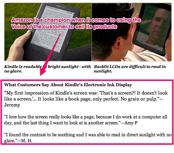
Telling Joe that your stuff is good does not have the same impact as hearing Jill, one of your customers, say that you’re awesome and that your stuff is like Manna from heaven. So why not let your customers sell your stuff for you?
Notice how all three statements talked about the same feature/benefit – could it be because the electronic ink display is the Kindle’s main UVP? (wink)
D. Joe Doesn’t Know What She Should do Next to Get What She Wants, and How
Here is where usability issues could come into play. Since usability is a broad topic, let me just hone in on one of the most common usability issues :
8. Lack of Active Guidance from You
A classic example of this is having no clear Calls to Action, or having no clear guidance on ways for Joe to “move forward”. In the words of MarketingExperiments.com :
If you don’t guide visitors to your main objective, someone else will. Use the five elements of guiding eyepath (size, shape, color, position, and motion) to clearly communicate with your visitors (1) where they are, (2) what they can do on your page, and (3) why they should do it. In seeking to answers these questions, you may find that the less (distractions) you put on your page, the higher your conversion rate will be.
Remember that just because the next step may be clear to YOU, doesn’t mean it’s clear to Joe (even if you think you’re vey much like Joe). Don’t expect them to unravel the mystery behind your cryptic copy and secret offer.
Saying that though, what most internet marketers are guilty of is having too much call to action, to the extent of being douchy and annoying (e.g., having the buy now” button inserted every 5 sentences, or having big red animated arrows pointing to the call to action buttons).
Remember that people buy not because you told them to click a button. People buy because they think you are best positioned in the marketplace to give them what they want.
9. Confusing – could be the copy, the layout, the design, the way the information is presented/organized.
For example, I found this e-commerce website in webpagesthatsuck.com :
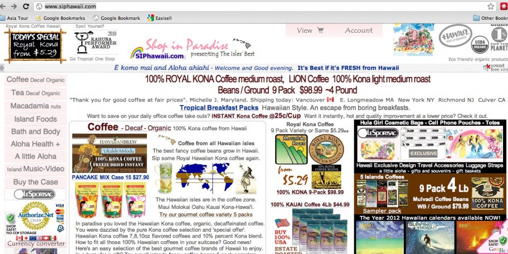
This website is trying to cram too much information everywhere, that it’s difficult to decide what you should do first or what to click. Everything jumps out at you, competing for your attention, and there is no clear thought sequence to follow.
If you want to convert, think of ways how you can make your visitors’ experience easy, pleasurable and hassle-free.
E. Joe has Questions, Fears, Uncertainties and Doubts that You Hadn’t Fully Dealt With
At the heart of every failed sale are prospects’ questions, fears, uncertainties and doubts (FUDs) that were left unaddressed. A few examples are:
10. Important information is difficult to find, or buried somewhere inconspicuous.
Hands up if you’ve been to a website and the pricing is impossible to find in one or two clicks. Or how about a restaurant website with no link to their address, no map to their location, and their phone number is nowhere to be found?
Or the menu requires you to opt-in before you can view it or they require you to download it?
Frustrating, isn’t it?
11. There simply isn’t enough information.
Have you ever been to an e-commerce site before that’s selling a product you’re interested in, only to get frustrated because there is no (or very little) product description?
Have you ever been presented with the buy button, when you don’t even know yet what the product could really do for you?
One thing I noticed is that many marketers are afraid to create “long” sales copy. If you’re asking someone to make a buying decision, give them all the information they need to make a well-informed decision!
12. Short-term thinking.
I once helped create a sales page that converted at slightly above 5% when it was first launched, but we soon realized that the customers we’re getting didn’t actually understand what was included in the packages they bought, resulting to a lot of support emails from frustrated customers with false expectations (the offer was quite technical and expensive).
We revised the page, which resulted to a much longer copy as more information needed to be presented and clarified to avoid misunderstandings. After the first revision it converted lower than 5%, but the customers we acquired were our ideal customers, there were very little complaints, and certainly no refund threats nor were there any unreasonable demands. Conversion was lower, but our net profit was higher because overheads, refund rate and stress were considerably lower, too.
I also know someone who had a similar experience during a super hyped-up launch. They had a high-converting page, but they also got a high refund rate and high levels of complaints from buyers. In the end, the marketer decided to stop using some of the selling tactics he used during the launch because his brand and reputation was more important to him.
Are you making the same mistake? Ask yourself what’s truly important to you over the long term.
Conclusion
Making your customers the center of your marketing universe is one of the pillars of conversion rate optimization. It’s a mindset, a philosophy, and a practice that you must do daily if you truly want to be a great marketer.
Evaluate your marketing materials and ask yourself this question: “In what ways am I committing <insert conversion boo boo here>?” Then look at your website pages one by one and identify how you’re hurting your site’s conversion. Develop your testing hypothesis, then test and measure the changes you made.
Happy testing, and don’t forget to report back here with links to conversion boo-boo’s you see around the web! 🙂
About the Author
Marj Galangco is a certified Conversion Rate Optimization and Web Analytics Practitioner. She’s also the co-director of Easisell, a company offering premium web design and web development services to successful internet marketers.







![[GET] WSO – Revealed: How to create backlinks that will blast your website to page one of](https://seo.maxiaodong.com/wp-content/plugins/wordpress-23-related-posts-plugin/static/thumbs/7.jpg)