The original intent for the Facebook fan page was to get non-fans to click the Like button.
Most welcome pages still exist primarily to fulfill this purpose, but large companies have started to dabble with more creative uses of the almighty welcome page.
You can have an affordable and high-end web designer or developer get more out of your welcome page by visiting AwesomeWeb.com
Here’s 20 of the best designed Facebook fan and welcome pages in terms of how well they convert and how creatively they’re promoting their brand.
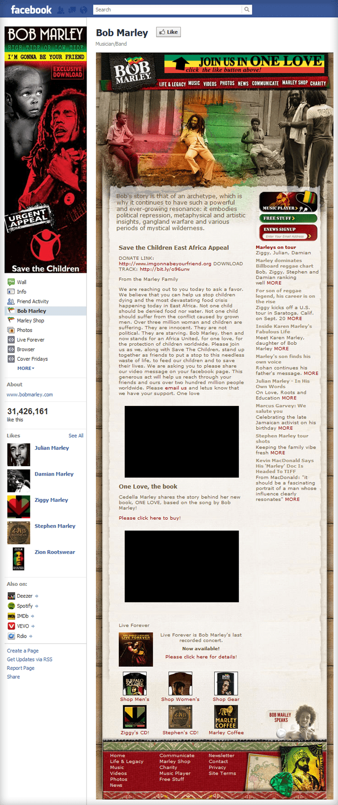
Bob Marley
I included the Bob Marley welcome page because it doesn’t ask you to “Like” Bob Marley. It asks you to join a movement that Bob Marley dedicated his career towards promoting, “One Love”.
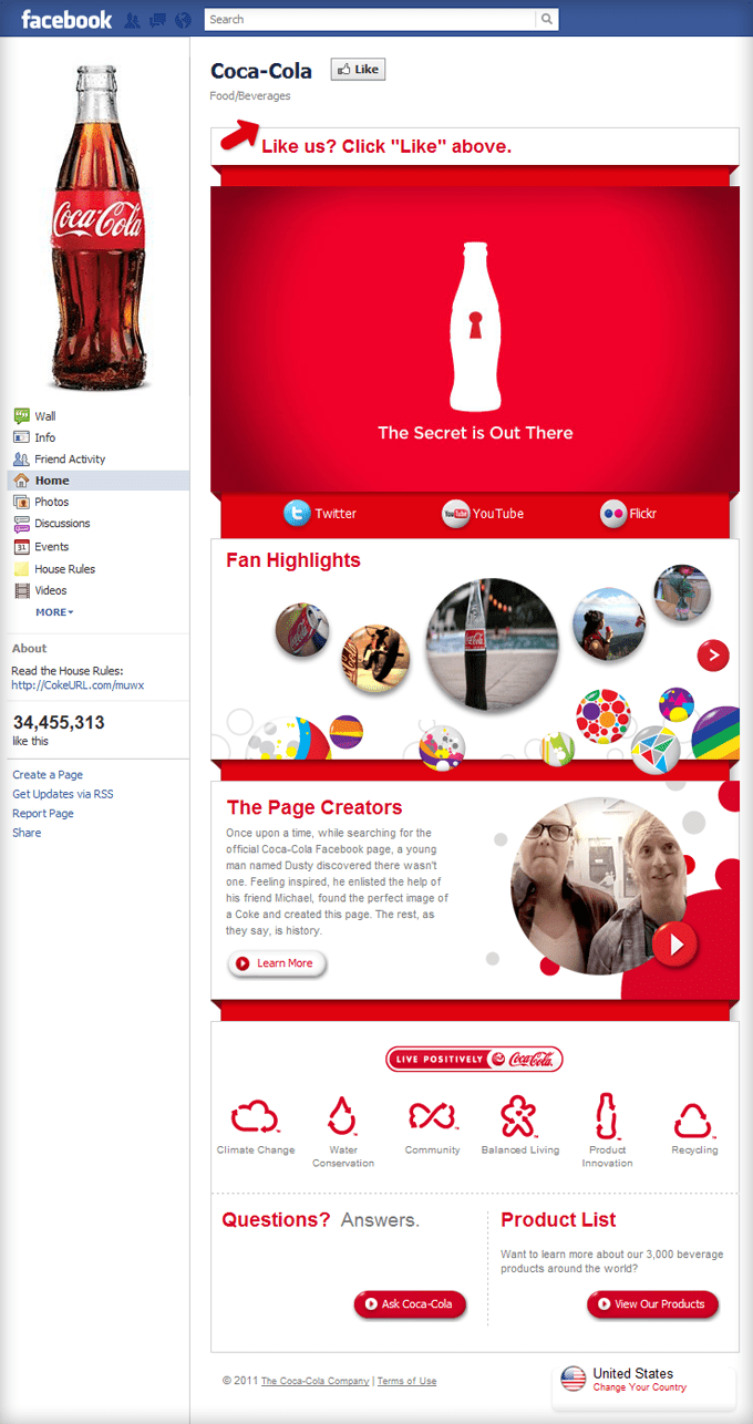
Coca-Cola
The Coca-Cola fan page emphasizes the “Like” button with a simple, 5-word call-to-action. It coincides with their latest “The Secret is Out There” YouTube campaign and they creatively incorporate fan photos as well.
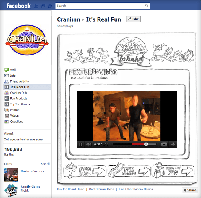
Cranium
What better way to promote a board game than to showcase YouTube videos of real people playing the game and clearly enjoying themselves? This isn’t Cranium’s welcome page, but it’s a creative use of pages to help promote the fun nature of their brand.
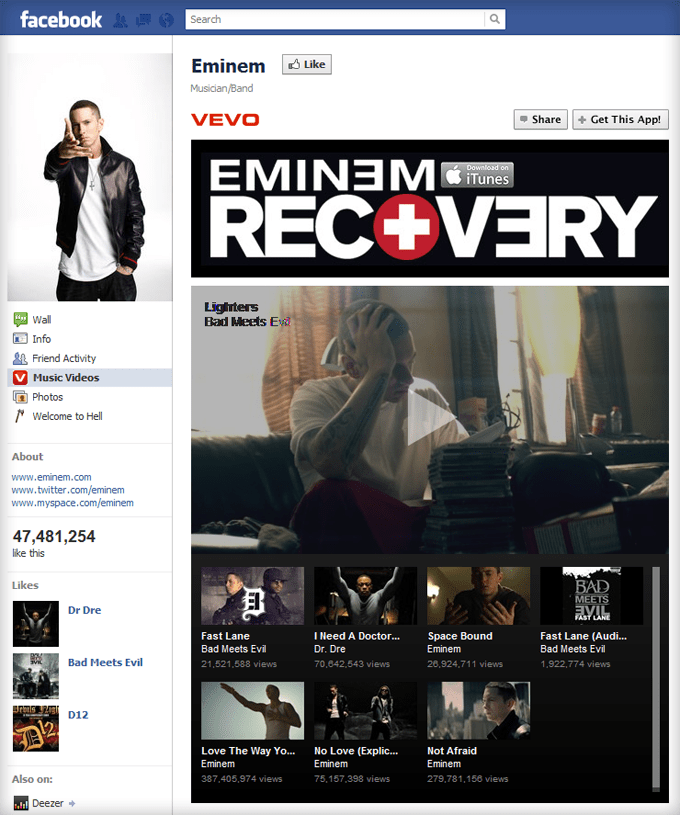
Eminem
Eminem is the second most-liked page on Facebook (behind, you guessed it, Facebook). It spotlights his latest music videos, but before you can play them, you need to “Like” the page.
Gary Vaynerchuk
If you read IncomeDiary, you probably know Gary. But most people don’t. So the first question his Facebook page answers is, “Who is Gary Vaynerchuk?” It’s a creative way to tell Gary’s story as well as make you think, “This guy is worth becoming a fan of.”

Get 10K Fans
Brian Moran’s Get 10,000 Fans is one of the world’s most interesting Facebook case studies. His welcome page is simple, highly effective, and you get the sense that it’s the tip of the iceberg as far as how much there is to learn from him and his page.

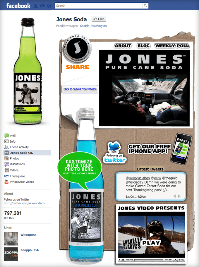
Jones Soda
The Jones Soda welcome page is simple, well-designed, and captures the essence of the brand they’ve been building for 24 years.
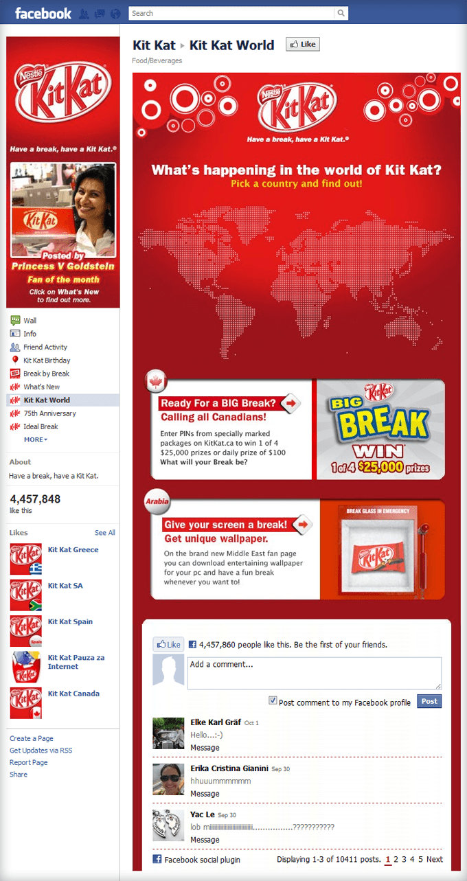
Kit Kat
Kit Kat is one of the few brands that creatively highlights a “Fan of the month” in their profile picture. They’ve also integrated the Facebook Comments plugin within their fan page to capture their visitors when they scroll to the bottom of the page.
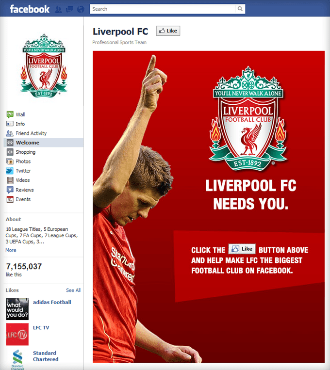
Liverpool FC
Most fan pages use arrows draw attention to the Like button. Liverpool FC, however, uses one of their players to point out the button.
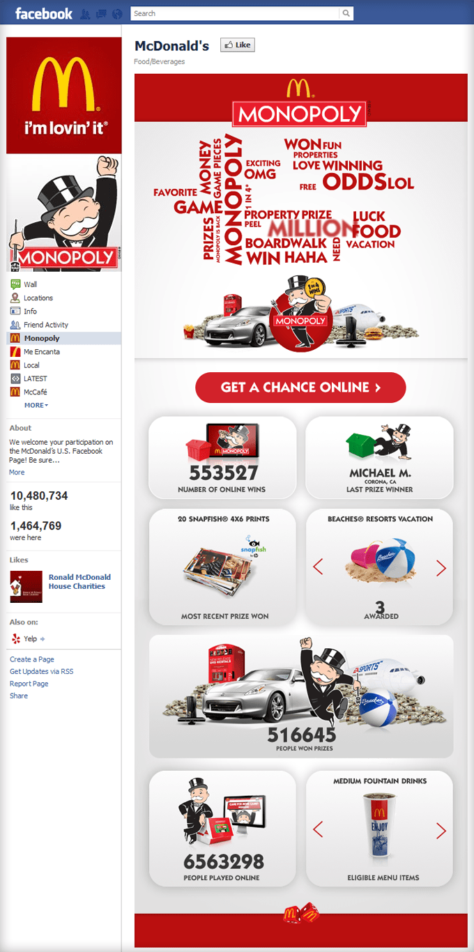
McDonald’s
McDonald’s uses their welcome page to promote their annual McDonald’s Monopoly game by trying to get you to play online as well.
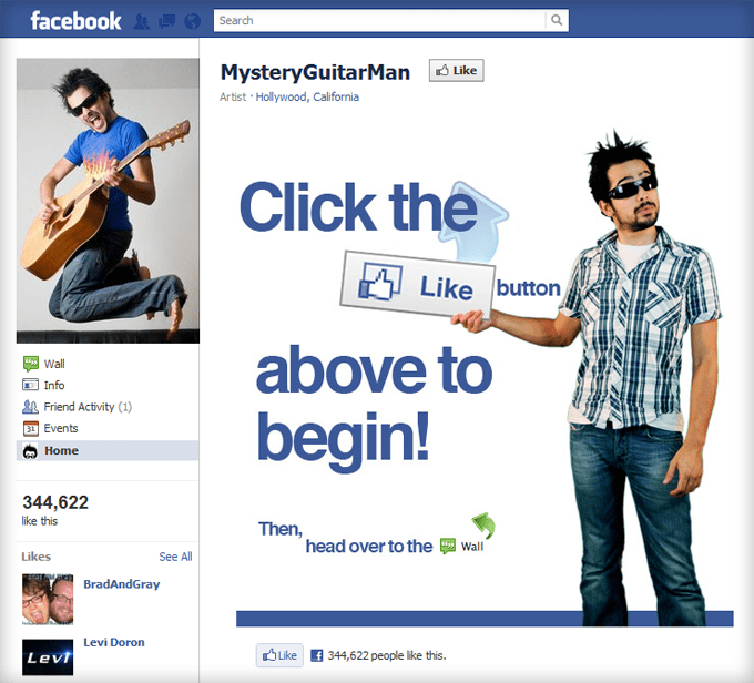
MysteryGuitarMan
With 344,000+ fans, MysteryGutiarMan is one of the most-liked, non-celebrity people in the world. Partly because of how simple his welcome page is. Notice that he included another “Like” button at the bottom.
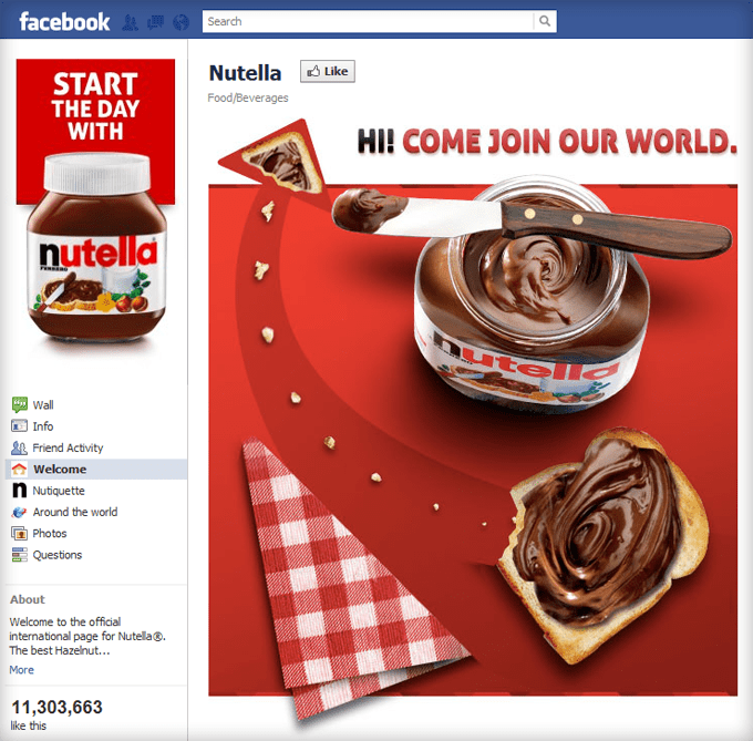
Nutella
Nutella’s fan page is my favorite of the bunch. The product looks delicious, the arrow points directly to the “Like” button, and “Join our world” makes me want to know more about their world.
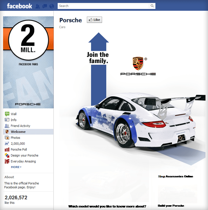
Porsche
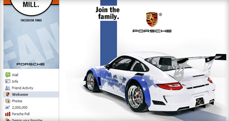
Porsche’s Facebook page is simple on the surface but they subtlety include transparent images below as though, “once I click ‘Like’ I’ll be able to see what those images are.”
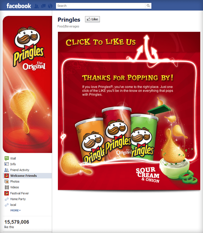
Pringles
Pringles has one of the older Facebook welcome pages in this list. All the sparkles make it exciting.
Red Bull
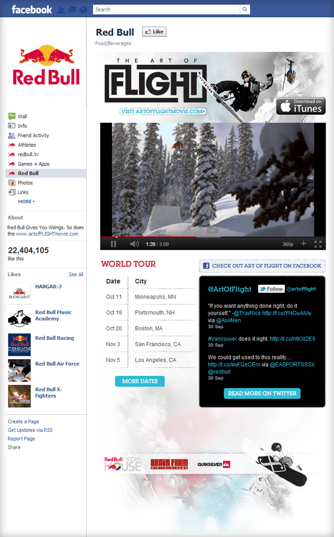
Red Bull uses their welcome page to promote an extreme sports movie they’ve created called, The Art of Flight. The trailer is as captivating as their brand.
Skittles
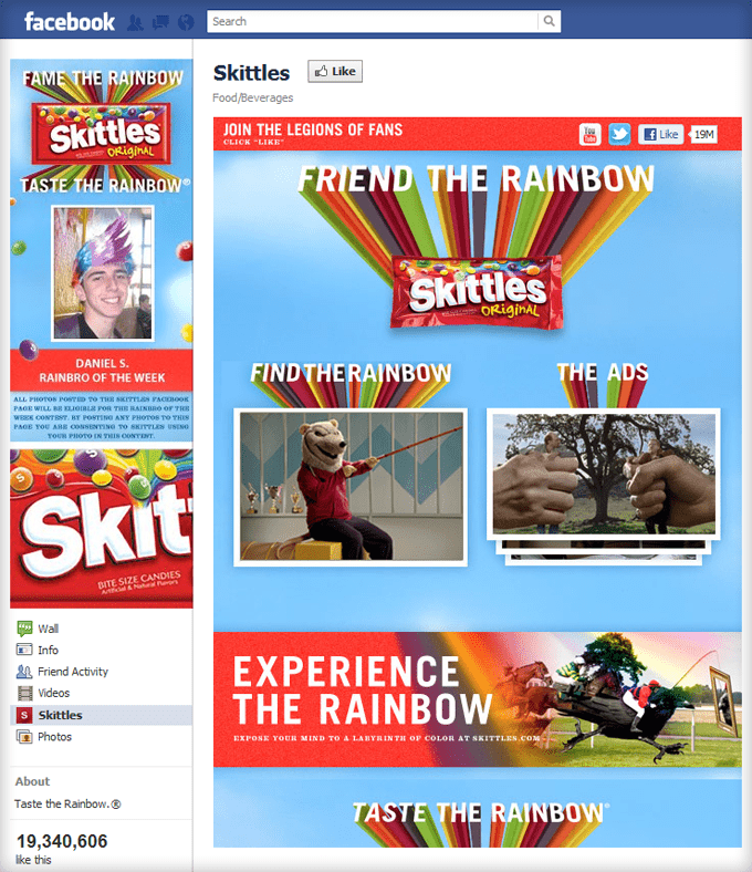
In terms of design, I think the Skittles Facebook page takes the cake. Similar to Kit Kat’s Fan of the month, they have a “Rainbro of the Week.” It’s well-designed, well-branded, and makes them seem cool.
Starbucks
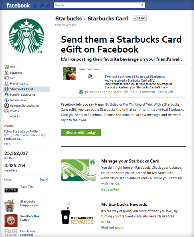
The normal Starbucks welcome page is used to promote their latest drinks and specials. But below you’ll find a page where you can send Starbucks eGift Cards to your friends through Facebook. I think we’ll be seeing a lot more of this in the near future.
Starburst
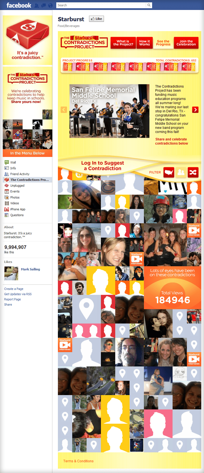
Starburst uses their welcome page to promote the Contradictions Project which is aimed at keeping music in schools.
Windows
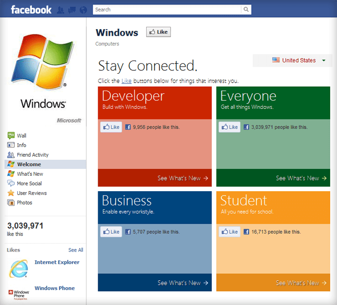
What? Windows made a “Best Designed” list? Yep. Not so much because of the graphic design, but because of how they segment their audiences so they can capture up to four new fans with one welcome page.
Zappos.com
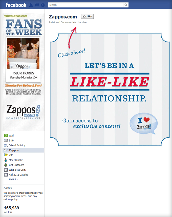
The Zappos.com fan page is simply gorgeous.
3 Common Facebook Page Elements
Looking back at these examples, I noticed three common elements between most of the pages.
- Arrows – Arrows direct your eyes to the most important part of the page, the Like button.
- Red – 12 of these 20 pages use red as the primary color to grab your attention and create an exciting sense of urgency as though you’re going to miss out if you don’t “Like” the page.
- Like vs. Join – “Like” implies a one-time encounter while “Join” involves commitment to the brand/movement. You want people to join you, not just like you.
I hope I’ve inspired and enlightened you as far as what makes a great Facebook fan page design.
What other welcome pages are you a fan of?
